Responsive design has become a staple in the modern web design. From menu to grid columns even with the images and videos, responsive is always a feature to consider.
As the use of modern gadgets like mobiles and tablets increases, the consideration of what the website will look like on each viewport is always a look out.
In this tutorial, we will go over the process in coding a flat responsive menu easily with CSS3 and jQuery. Let’s get started.
Resource you need to complete this tutorial
- jQuery Library (You can also use Google’s Hosted library)
- Open Sans (Google Font)
- Basic Knowledge of CSS3 and jQuery
- Time and Patience
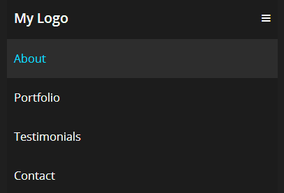
What we are going to build
Getting Started
Before diving into our markup we need to add some links first to our CSS and jQuery files. Copy the code below in the head section of your HTML file.
<!DOCTYPE html>
<html lang="en-US">
<head>
    <meta charset="utf-8">
    <meta name="viewport" content="width=device-width, initial-scale=1.0, maximum-scale=2.0"/>
    <title>Demo</title>
    <link href="css/style.css" rel="stylesheet" type="text/css">
    <script src="js/jquery-1.11.1.min.js" type="text/javascript"></script>
   <link href='http://fonts.googleapis.com/css?family=Open+Sans:300italic,400italic,600italic,700italic,400,300,600,700' rel='stylesheet' type='text/css'>
</head>
The Markup
For our HTML, we will simply wrap everything in a nav element with a class of nav-bar. Then we will also create a div with a class of nav-container as our second or inside container. The elements inside our nav-container class will include a logo with a class nav-logo, a line menu using the unicode ☰ with an id of nav-menu and a class of nav-menu (this will be hidden later on and will only be displayed on small screen). Finally our list of menu will include a ul tag with a class nav-list and an id nav.
<nav class="nav-bar"> <div class="nav-container"> <a href="#" class="nav-logo">My Logo</a> <a id="nav-menu" class="nav-menu ">☰ </a> <ul class="nav-list " id="nav"> <li> <a href="#">About</a></li> <li> <a href="#">Portfolio</a></li> <li> <a href="#">Testimony</a></li> <li> <a href="#">Contact</a></li> </ul> </div> </nav>
With this markup you’ll get similar result like the image below.

The CSS
Now let’s turn our boring markup into something lively. To start off, we will put our general styles first for our links and body background.
body {
    font-family: 'Open Sans', sans-serif;
    background: #e2e2e2;
}
a {
    text-decoration: none;
}
Now let’s some width settings for our nav-container and the container class itself. We will set the width in a percentage measurement with a 95%. Then give it a maximum width of 1000px. Finally, center it on the screen on give it a nice background with hexadecimal color #1c1c1c.
.nav-container,.container {
    width: 95%;
    max-width: 1000px;
    margin: 0 auto;
    background: #1c1c1c;
}
Let’s now finalize our design for all of our remaining styles. These will include our styles for our logo, nav-bar class, the links as well as other id’s and classes.
.nav-container,.container {
    width: 95%;
    max-width: 1000px;
    margin: 0 auto;
    background: #1c1c1c;
}

/*NAVIGATION */
.nav-bar {
    width: 100%;
    background: #1f1f1f;
}

.nav-container {
    overflow: hidden;
}

.nav-logo {
    float: left;
    display: block;
    padding: 20px 10px;
    color: #f9f9f9;
    font-weight: 600;
    font-size: 1.2em;
}

.nav-logo:hover {
    color: #09d9ff;
}

.nav-list {
    float: right;
}

.nav-list li {
    float: left;
}

.nav-list li a {
    display: block;
    color: #f9f9f9;
    padding: 20px 10px;
    font-size: 1em;
}

.nav-list li a:hover {
    color: #09d9ff;
    background: #2d2d2d;
}
The Media Queries
Now it’s time to make our menu responsive. Add the following codes below on your CSS file.
@media screen and (max-width: 768px) {
.nav-menu{
	color: #fff;
	float: right;
	display: block;
	padding: 20px 10px;
	cursor: pointer;
}

.nav-list{
float: left;
width: 100%;
overflow: hidden;
height: 0;

}

.nav-open{ height: auto; }

.nav-list li {
	width: 100%;
}

}
Notice that on 768px viewport, we set up a class nav-open. This will give a height to our menu list when the menu list icon was clicked. We also give our nav-list a width of 100% to make sure that they will collapse on each other starting on 769px.
The Script
Now to finish off our responsive menu, we will add our jQuery below before the closing of tag. This jQuery code will simply select the list of menus and add the class nav-open to give it a height of auto and then slide down to display the navigation by 300 milliseconds duration.
$(document).ready(function(){
	$('#nav-menu').click(function(){
		$('ul.nav-list').addClass('nav-open').slideToggle('300');
	});
Conclusion
There you have it! Congratulations! You just made a cool flat responsive menu with just a few lines of codes. On this tutorial we have come through all the way to create a responsive navigation from scratch.
Although there are some jQuery plugins out there like SelectNav.js, for me doing it with this simple code is much better.
Hope you learned from this tutorial and let me know about your thoughts or if you have other ways that you’ve come up with to do the same menu, I am interested. Just drop by on the comment box.