The term “METRO” style is the new interface of Microsoft applications that is usually used on Windows 8 and Windows Mobile Phone OS. It has a flat design which comes with simple formatted based on tiles and usually comes in different sizes.
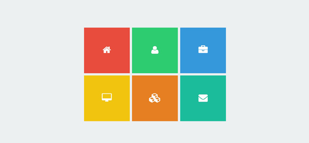
Check out the example interface below.
Resource you need to complete this tutorial
• Font Awesome
• Opens Sans (Google Font)
• Basic Knowledge about CSS3 transition and transform
• Time and Patience
Getting Started
To start off, we need to put some codes on the head section. This will include meta tags and links to the CSS, Google Font and Font Awesome.
<!--[if IE 8]> <html lang="en" class="ie8"> <![endif]-->
<!--[if !IE]><!--> <!--<![endif]-->
<meta charset="utf-8" />
Flipping Metro Style Menu
<meta name="description" content="A flipping metro style menu" />
<meta name="author" content="Sam Norton" />

	<!-- Stylesheets -->
		<link href="css/style.css" rel="stylesheet" />
  	<link href="http://fonts.googleapis.com/css?family=Open+Sans:400italic,400,300,600,700" rel="stylesheet" type="text/css" />
  	<link href="//maxcdn.bootstrapcdn.com/font-awesome/4.1.0/css/font-awesome.min.css" rel="stylesheet" />

	<!--[if lt IE 9]>
		<script src="http://html5shim.googlecode.com/svn/trunk/html5.js"></script>
	<![endif]-->
The Markup
To develop this menu, we will use an unordered list and wrap all of them within a nav tag.
</pre>
<nav>
<ul>
	<li>
<div class="front" id="box1"></div>
<div class="back">Home</div></li>
	<li>
<div class="front" id="box2"></div>
<div class="back">About</div></li>
	<li>
<div class="front" id="box3"></div>
<div class="back">Portfolio</div></li>
	<li>
<div class="front" id="box4"></div>
<div class="back">Services</div></li>
	<li>
<div class="front" id="box5"></div>
<div class="back">Products</div></li>
	<li>
<div class="front" id="box6"></div>
<div class="back">Contact</div></li>
</ul>
</nav>
<pre>
Notice that within each list item there are two divs with class front and back. This will be manipulated by our CSS later on to hide and unhide the front and back face when hovering. We also included a font-awesome icon tags to display an icon on the front face while the name of the menu on the back face.
Each front face div will also have its unique color using the id color along with its number.
The CSS
For this part of the tutorial, let’s work first on the general styles. We will put some styles for the body, ul tag and li tag.
  body {
    background: #ecf0f1;
}
ul {
    width: 50%;
    margin: 120px auto;
}
li {
    width: 200px;
    height: 200px;
    margin-right: 10px;
    margin-bottom: 10px;
    float: left;
    list-style: none;
    position: relative;
    cursor: pointer;
    font-family:'Open Sans';
    font-weight: 300;
    -webkit-perspective:1000;
   -moz-perspective:1000;
    -ms-perspective:1000;
     -o-perspective:1000;
        perspective:1000;
}
There is nothing special here, except the perspective property. The perspective property defines how many pixels a 3D element is placed from the view.
Next, we will add the styles for our front and back face plus the div tag.
div {
    color: #fff;
    width: 100%;
    height: 100%;
    position: absolute;
   /*transition*/
-webkit-transition:all 0.5s ease;
   -moz-transition:all 0.5s ease;
     -o-transition:all 0.5s ease;
        transition:all 0.5s ease;
/*backface-visibility*/
-webkit-backface-visibility:hidden;
   -moz-backface-visibility:hidden;
    -ms-backface-visibility:hidden;
     -o-backface-visibility:hidden;
        backface-visibility:hidden;
}
.front {
    z-index: 3;
    color: #fff;
    text-align: center;
    line-height: 210px;
    font-size: 20px;
    background: #e3e3e3;
}

.back {
    color: #fff;
    text-align: center;
    line-height: 200px;
    font-size: 22px;
    -webkit-transform:rotateY(180deg);
   -moz-transform:rotateY(180deg);
    -ms-transform:rotateY(180deg);
     -o-transform:rotateY(180deg);
        transform:rotateY(180deg);
    background: #34495e;
}
A lot of things going on this part. On our front face, notice that we set it up with a z-index: 3. This property is assigned with an integer value (positive or negative), which represents the position of the element along the z-axis.
If you are not familiar with the z-axis, imagine the page has several layers one above the other. Each layer is numbered. A layer with a greater number is rendered above layers with smaller number.
For the back face, I set up a transform property with a value of 180 degrees. Setting rotateY to 180 degrees defines a starting position for our animation. It also defines the position for the animation to end when we move our mouse away from the element.
Next, let’s add the juicy part.
li:hover > .front{
    z-index: 0;
  -webkit-transform:rotateY(180deg);
   -moz-transform:rotateY(180deg);
    -ms-transform:rotateY(180deg);
     -o-transform:rotateY(180deg);
        transform:rotateY(180deg);
}
li:hover > .back {
    -webkit-transform:rotateY(0deg);
   -moz-transform:rotateY(0deg);
    -ms-transform:rotateY(0deg);
     -o-transform:rotateY(0deg);
        transform:rotateY(0deg);
}
Setting up rotateY to 180 degrees on the front class of the :hover pseudo-class, we inform the browser to rotate the element by 180 degrees on the (vertical) Y-axis when the list item has a :hover pseudo-class on it. While setting up the rotateY to 0 degrees defines the starting position of our animation.
Finally, let’s add the style which is basically the background color of our front class list item.
#box1 {
    background: #e74c3c;
}
#box2 {
    background: #2ecc71;
}
#box3 {
    background: #3498db;
}
#box4 {
    background: #f1c40f;
}
#box5 {
    background: #e67e22;
}
#box6 {
    background: #1abc9c;
}
Wrapping Up
You just learned how to create an awesome flipping metro style menu using CSS3 and HTML5 only.
I hope the content of this article are useful in helping web developers interested in developing a layout style meter.
Feel free to leave a comment if you have any questions.