The Responsive Web Design approach is aimed towards crafting a website into being able to provide an optimal viewing experience for the end user— with easy reading and navigation and with a minimum of re-sizing, panning, and scrolling—across a wide range of devices, ranging from mobile phones & handheld devices to desktop computers.
Being able to create a responsive site doesn’t have to be an arduous endeavor if one equips themselves with the right set of tools and builds upon a flexible Grid framework, as well as being able to utilize responsive images into that design.
In this article we would like to present you with a list of 50 Excellent Grid Tools which will enable you to get started within creating your own responsive web design. We hope that you will find the list useful and geared to your needs. If we have missed anything which is not listed here on this list, please let us know which grid framework you are utilizing within your own projects and which would you strongly recommend to our readers. Leave your feedback in the comment section below.
Enjoy!
1. Grid Forms
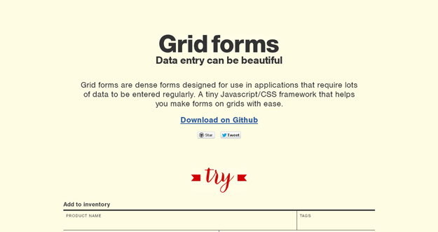
An effort to make beautiful forms for web applications that make data entry less painful. Grid forms is a front-end library which handles the boiler plate necessary to build grid based forms.
Grid forms are dense forms designed for use in applications that require lots of data to be entered regularly. It’s a tiny Javascript/CSS framework that helps you make forms on grids with ease. You can also include Scott Jehl’s Respond.js if you want the form to be responsive in ie8.
2. Skeljs
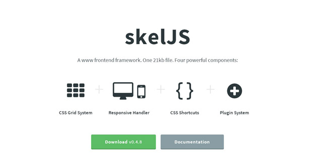
skelJS is a lightweight frontend framework for building responsive sites and apps. Consisting of only a single JS file (weighing in at just 18kb as of this version), it gives designers and developers access to four powerful components: CSS Grid System, Responsive Handler, CSS Shortcuts and Plugin System.
A sophisticated 12 column CSS grid system with a concise, uncluttered syntax, adjustable gutters, unlimited nesting support and many more cool features. A streamlined replacement for CSS media queries designed to handle all of your responsive needs. Simple to configure, built to handle any number of breakpoints, and capable of doing much more than simply shuffle stylesheets.
3. Bourbon Neat
Bourbon Neat is an open source fluid grid framework built on top of Bourbon with the aim of being easy enough to use out of the box and flexible enough to customize down the road. It is built on top of Sass and Bourbon using em units and golden ratios.
Using Sass 3.2 block mixins, Neat makes it extremely easy to build responsive layouts. Using the breakpoint() mixin, you can change the number of columns in the grid for each media query and even store these values in project-wide variables to DRY up your code. It has been tested on Firefox 3.5+, Safari 4.0+, Chrome 4.0+, Opera 9.5+ and IE 8+.
4. Ink

Ink helps you quickly create responsive HTML emails that work on any device & client. You can reach out your tentacles to a broad range of people who subscribe to your emails. The CSS framework helps you craft HTML emails that can be read anywhere on any device.
Gone are the days where you had to choose between Outlook and email optimized for smartphones and tablets. Ink’s responsive, 12-column grid blends flexibility and stability so your readers can view your emails perfectly from wherever they may be.
5. Foundation
Millions of designers and engineers have adopted Foundation for their product and website design front-end workflow. Foundation was the first open-source framework to be responsive, semantic, mobile first and now, have partials with Interchange. Foundation 5 has just released, which is the fastest release to date – faster in all aspects of building products and websites.
6. Furatto
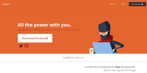
Furatto is a front-end framework, that uses Bootstrap and Foundation as a base, for developing websites quickly. The framework makes use of the popular flat UI trend and built with responsive layouts in mind. Besides the typography + grid, it has styles for all the major elements like buttons, tables or forms and various JavaScript components like modal or tooltips. The colors and styles used in Furatto can be changes easily as it uses Sass and it is a must-bookmark framework specially for flat UI fans.
7. Gumby
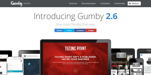
Gumby Framework is a flexible, responsive CSS Framework, Powered by SASS. Create rapid and logical page layout and app prototypes with a flexible and responsive grid system and UI kit. It is built with the power of Sass. Sass is a powerful CSS preprocessor which allows us to develop Gumby itself with much more speed — and gives you new tools to quickly customize and build on top of the Gumby Framework.
8. Ivory
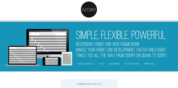
IVORY is a lightweight front-end framework that can handle responsive layouts from 320px to 1200px widths. It has a 12-column grid and comes with styles for typography, forms, buttons, tables, pagination, toggle-switches, tooltips, accordion, tabs and more.
9. Cardinal
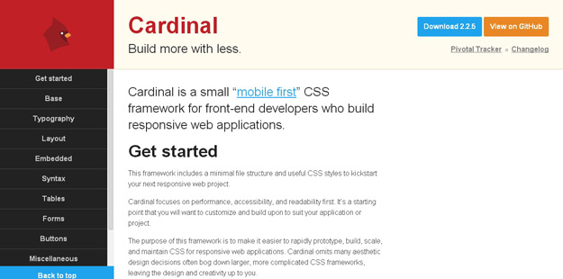
Cardinal is a small, “mobile first” CSS framework with some useful default styles, scalable typography, reusable modules, and a simple responsive grid system.
Cardinal provides a new approach to scaling web typography and layout across multiple devices. It places little emphasis on pixel-precision, but does not restrict its usage.
10. Extra Strength Responsive Grids
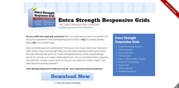
Extra Strength Responsive Grids is a CSS framework that comes with solutions to various issues experienced in responsive layouts. The framework is completely grid-focused (no styles for typography, tables, forms, etc.) and uses percentage-based width adjustments. For smaller screens, besides using less columns, elements can be resized smartly.
11. Groundwork
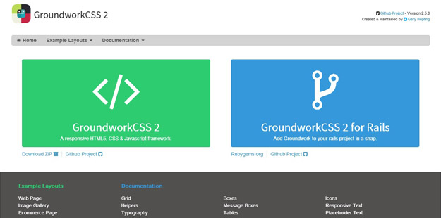
Groundwork is another good alternative that is built with SASS + Compassand offers an advanced responsive layout. It has a flexible, fluid and nestable grid system which makes creating any layout possible. The framework includes many UI components like tabs, buttons, forms, navigation, icons and more. Groundwork is documented very well and there are templates to get started quickly.
12. YAML
YAML is a CSS framework that is popularly known as Yet another Multicolumn Layout. The best part about this particular CSS framework is that it is perfectly compatible with almost all the browsers that are operative in today’s date.
13. 960 Grid System
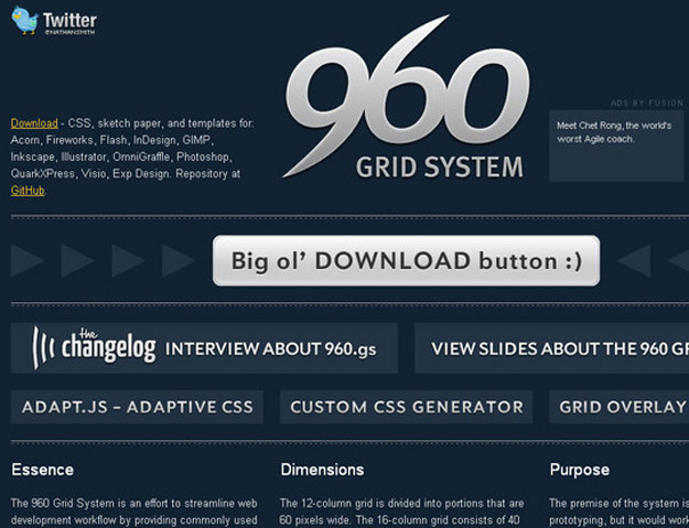
A CSS framework that is better known for helping you to organize your work flow as far as your website development is concerned is none other than the 960GS framework. Most importantly, the 960GS framework is known for offering you two diverse packages of twelve as well as sixteen columns that can either be used on its own or in accordance with one another.
14. Golden Grid System
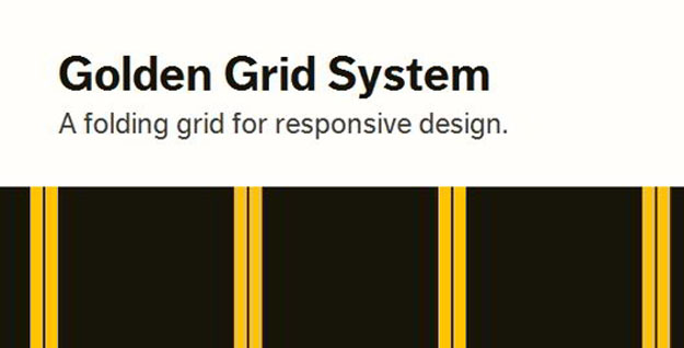
Golden grid a web grid system that is totally focused on grid-based designs (not a complete CSS framework). Golden Grid uses float:left approach for building grids rather than positions. It is a 6/12 column grid system with a 970px main width.
15. Responsive Aeon
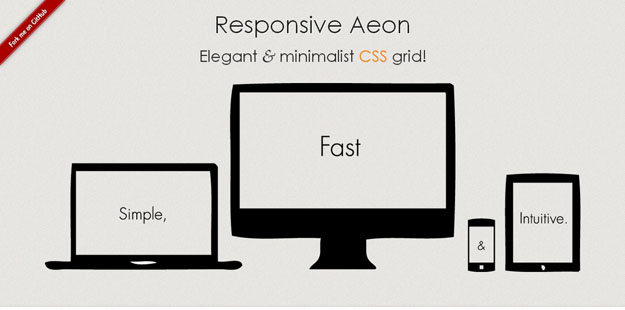
ResponsiveAeon is a HTML5/CSS3-powered framework for creating responsive layouts very quickly. It has a grid system that is based on 12 columns with 1104px width in total and offers a very easy to understand usage with only 3 basic classes.
16. Pure
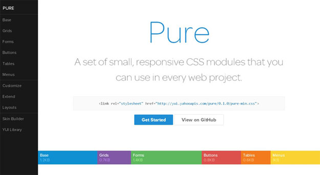
Pure is a fresh one that is created by Yahoo!. It uses Normalize.CSS and doesn’t use any JavaScript but only HTML-CSS. The framework is built with responsive layouts in mind and has styles for typography, grids, forms, buttons, tables and navigation.
17. Bootstrap
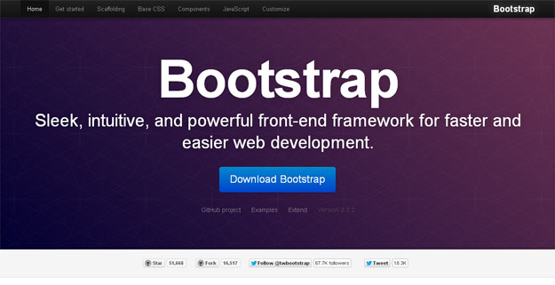
Twitter Bootstrap is a toolkit created by Twitter for kickstarting CSS when developing websites. It is built with Less and consists of base CSS + HTML for typography, forms, buttons, tables, grids, navigation, and some more. he grid provided is 940px wide 16-column and, for the layouts, there are solutions for both fixed + fluid ones.
18. Flurid
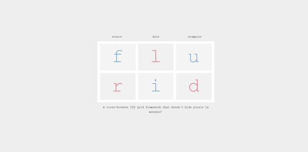
Flurid is a CSS grid framework which is designed to create cross-browser and fluid interfaces. Compared to many other fluid grid systems, Flurid doesn’t hide pixels in margins but uses overflow: hidden and width: auto properties to get rid of the extra pixels in the last column.
19. Less Framework
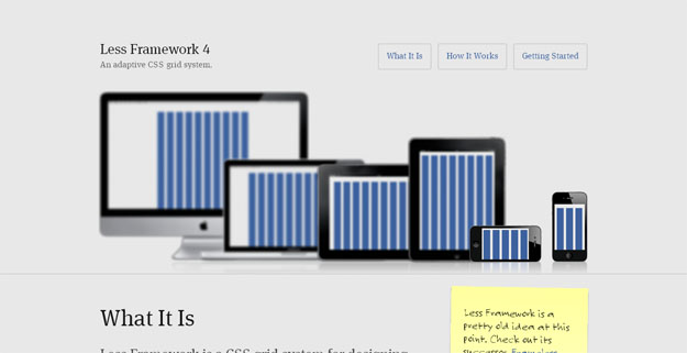
Less Framework is a lightweight CSS framework that enables you to build flexible multi-column website layouts. It contains an eight-column grid optimized for a line-height of 24px & a set of typography presets based on the golden ratio which is parallel to the grid’s vertical rhythm.
20. Baseline
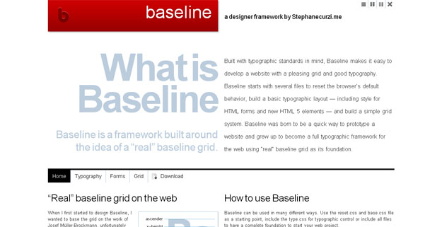
Baseline is a CSS framework, built with typographic standards in mind, that aims to simplify developing a website with a pleasing grid and good typography. With the help of reset.css & base.css files, Baseline clears the default behavior of your browser & builds a basic typographic layout to start with.
21. Gridless
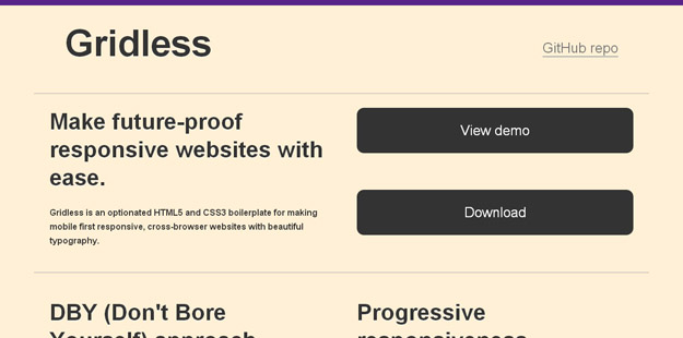
Gridless is a boilerplate for creating responsive and cross-browser/platform websites with beautiful typography. It doesn’t come with any grid systems, rather, the focus is on progressive enhancement and being a starting point for any project (which you can add a grid system later).
22. The Semantic Grid System
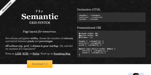
The Semantic Grid System is a fresh approach to CSS grids which allows us to define column-gutter widths, choose the number of columns and switch between pixels and percentages. And all these without the -kinda ugly-.grid_x classes used in the markup. It is built by Tyler Tate, the developer of the popular 1KB Grid and powered by Less.js (the dynamic stylesheet language).
23. Columnal
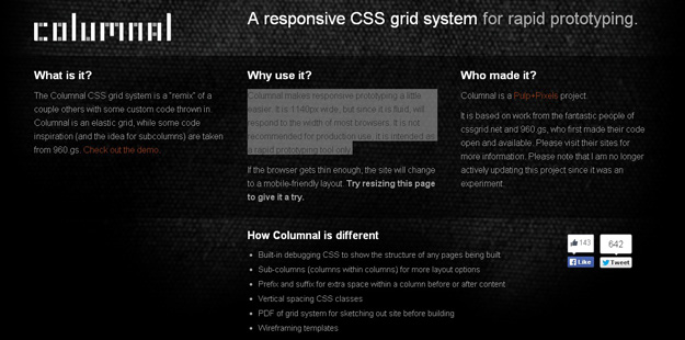
The Columnal CSS grid system is a “remix” of a couple others with some custom code thrown in. Columnal is an elastic grid, while some code inspiration (and the idea for subcolumns) are taken from 960.gs. Columnal makes responsive prototyping a little easier. It is 1140px wide, but since it is fluid, will respond to the width of most browsers. It is not recommended for production use, it is intended as a rapid prototyping tool only.
24. 978GS
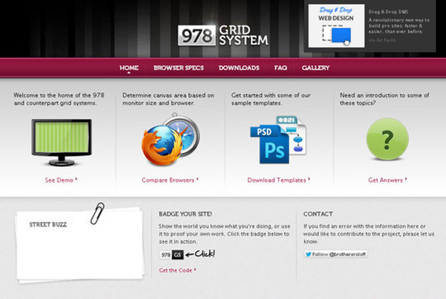
978 is a grid layout system that uses 12 columns at 54px, with 30px gutters. This comes out to a total of 978px, which uses up most of the space on a 1024×768 monitor.
25. One % CSS Grid
One% CSS Grid is a 12 column fluid CSS grid system. It’s been designed as a base for building responsive web layouts easily, quickly and with minimum effort. You don’t have to take care of resizing and rearranging your layout for each platform separately. One% CSS Grid will do all this for you.
26. Grid System Generator
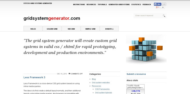
Grid System Generator is a website that asks for grid width, number of columns, margin-left/right & creates a fixed grid system with valid xhtml/css. Besides the CSS framework, a .PNG background file is created as well to help in prototyping and design.
27. Fitgrd
Fitgrd is not a framework. It’s a solid foundation to build up your own responsive website. It is designed for rapid prototyping, but also runs well in production environments. This grid system is perfect for advanced web designers who don’t want to have their pages look like “bootstraped”. Everything but the grid is up to you and gives you the ability to save a lot of dispensable code.
27. Responsive Boilerplate
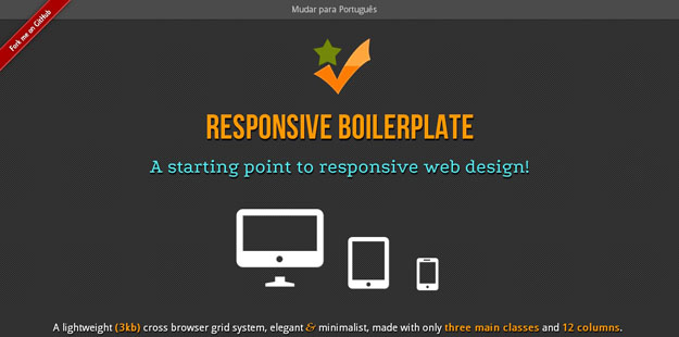
It is a lightweight (only 2kb) base that makes use of CSS3, for bringing responsive websites to life. The boilerplate has a single container + a 12-column grid and supports any content with images, video or fluid media with major breakpoints. Also, the download package include a PSD grid, Sublime snippets and some JavaScript for responsive navigations.
28. Simple Grid
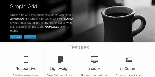
Simple Grid was created for developers who need a barebones grid. Simple Grid works well with 1140pxlayouts but easily adapts to any size of layout. With fluid columns, Simple Grid is responsive down to mobile.
29. Responsive Grid System
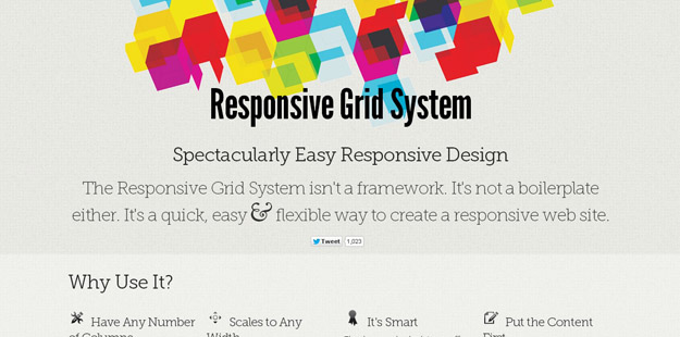
Responsive Grid System isn’t a framework or a boilerplate but a fast and simple way to create responsive websites. It doesn’t limit us to have a 12, 16 or 24 columns but works with any number of them and, can scale to any width.
30. Fluid Baseline
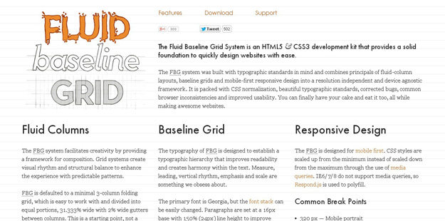
Fluid Baseline Grid System is a starting point armed with various resources to be a starting point for creating HTML5-CSS3-powered websites. It is built with typographic standards in mind with combining principals of fluid-column layouts, baseline grids and mobile-first responsive design into a resolution independent and device agnostic framework.
31. Gridpak
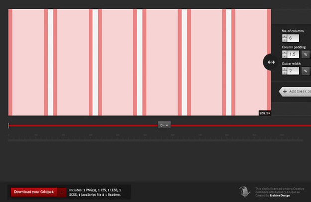
Gridpak is Responsive Web Design tool for creating grids by Erskine Design.
32. The Responsive Calculator
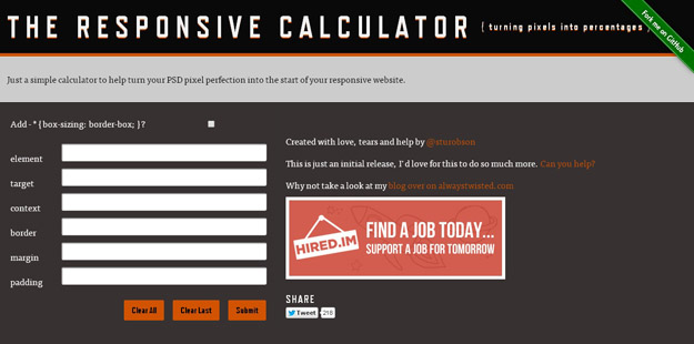
Just a simple calculator to help turn your PSD pixel perfection into the start of your responsive website.
33. Rwd Grid System
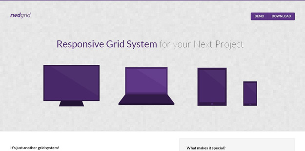
rwdgrid is just another Grid system based on popular 960grid , which is responsive and ranges from mobile, tablet, laptops and wide screen displays. Naming convention of this grid system is similar to 960 grid system, where underscore is replaced by hyphen (increases readabilty).rwdgrid is having different Grid system made for 1200px+ Displays, 960px+ Displays, 720px+ Displays and Mobile screens.
34. Tiny Fluid Grid
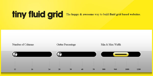
Tiny Fluid Grid lets you determine the grid system of your design. By setting the number of columns, gutter percentage and minimum and maximum widths of your design, the app can give you a downloadable CSS of your responsive grid
35. Variable Grid System
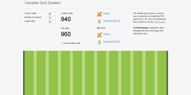
The variable grid system is a quick way to generate an underlying CSS grid for your site. The CSS generated file is based on the 960 Grid System.
36. Responsify
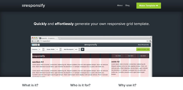
Responsify is a browser based tool, which allows you to create your own responsive template. Think of it as a foundation for you to build upon. You can customize the grid to suit your content, rather than trying to make the content fit the grid.
37. 1080 Grid System
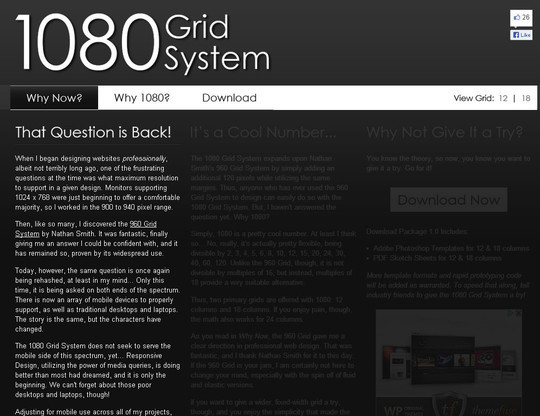
The 1080 Grid System expands upon Nathan Smith’s 960 Grid System by simply adding an additional 120 pixels while utilizing the same margins. Thus, anyone who has ever used the 960 Grid System to design can easily do so with the 1080 Grid System.
38. Mueller Grid System
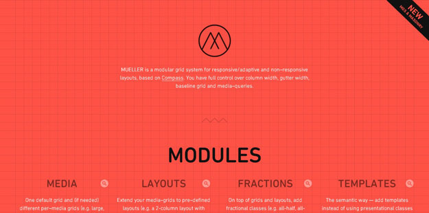
MUELLER is a modular grid system for responsive/adaptive and non–responsive layouts, based on Compass. You have full control over column width, gutter width, baseline grid and media–queries.
39. 34 Grid System
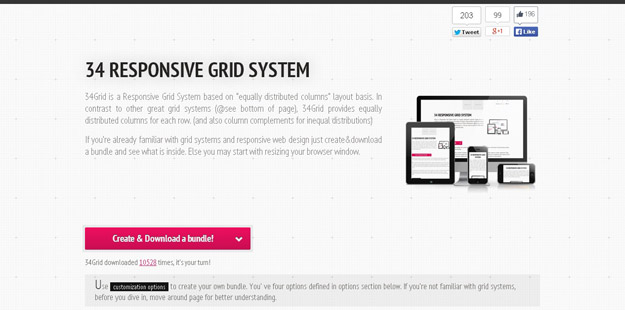
34Grid is a Responsive Grid System based on “equally distributed columns” layout basis. In contrast to other great grid systems (@see bottom of page), 34Grid provides equally distributed columns for each row. (and also column complements for inequal distributions).
40. dGrid
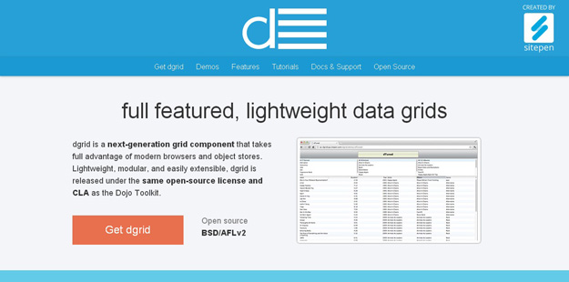
Dgrid is a next-generation grid component that takes full advantage of modern browsers and object stores. Lightweight, modular, and easily extensible, dgrid is released under the same open-source license and CLA as the Dojo Toolkit.
41. Zen Grids
Zen Grids is a responsive grid system built with Sass. It greatly simplifies creating your layout by removing most of the complicated markup you’d need to create responsive grid-based designs with pure CSS and HTML.
42. Cute Grids
Cute Grids is a grid system that offers a clean start for your responsive design. It’s mobile first, includes five media queries, and is well documented.
43. Susy
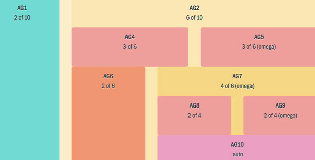
Susy is a responsive grid system for Compass. It lets you quick add new media-query breakpoints to your layouts, using their math or your own (with helpers).
44. GridSet
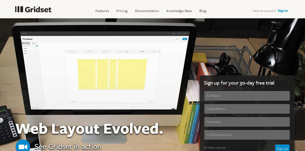
Designing grids with Gridset is as easy as dragging guides in Photoshop or Fireworks. Gridset provides whatever you need: PNGs, a comprehensive cheat sheet and CSS.
45. Grid
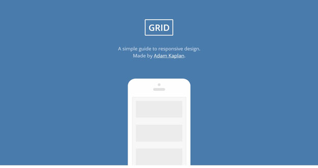
Grid is a simple guide to responsive design. By following those simple steps, you are on the path to responsive web design mastery. Keep practicing and help make the web a better, more useable place.
46. Grid Designer
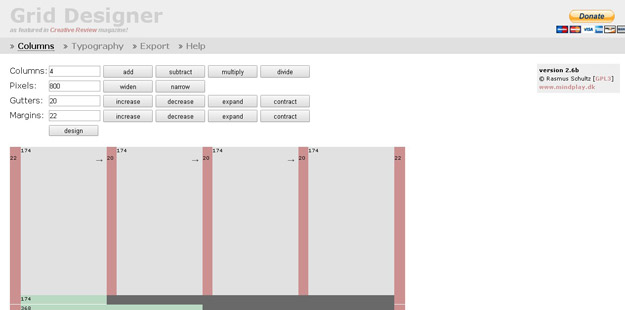
This tool enables you to create a CSS Grid by specifying the number of columns and the widths of the columns, gutters and margins.
47. Blueprint Grid CSS Generator
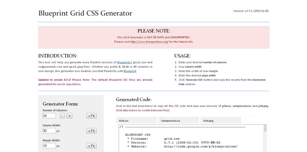
This tool will help you generate more flexible versions of Blueprint’s grid.css andcompressed.css and grid.png files. Whether you prefer 8, 10,16 or 24 columns in your design, this generator now enables you that flexibility with Blueprint.
48. The Grid System
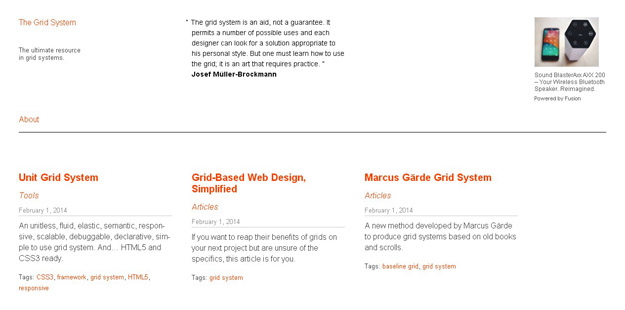
The Grid System is an exceptional tool for creating responsive layouts.
49. Grid Displayer
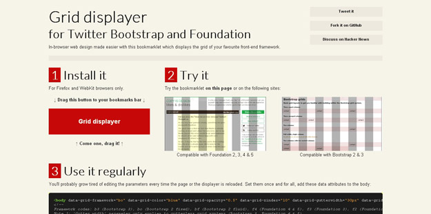
Grid Displayer is a boomarklet that displays the grid of both Twitter Bootstrap (fixed and fluid grid) and Foundation (2.0 and 3.0). It works with Firefox and WebKit browsers.
50. The Grid
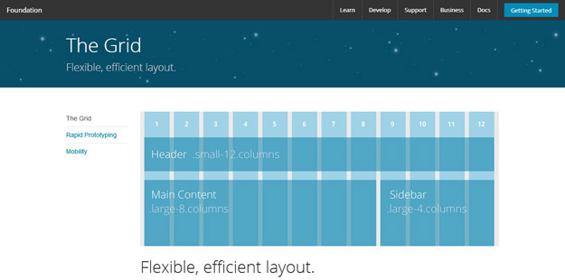
It’s a 12-column flexible grid that can scale out to an arbitrary size (defined by the max-width of the row) that’s also easily nested, so you can build out complicated layouts without creating a lot of custom elements.

