The new year is coming soon. Why not take this opportunity to give your website a much-needed makeover?
Trends in web design are fascinating. Not only do they predict what your audience wants before they want it, but they also help your SEO rankings.
2018 web design trends started to dip their toes into mobile-friendly designs. We also saw a lot more custom icons and dynamic layouts. There were even animated photos to spice up your online shopping experience.
Web designs in 2019 promise to take what we started in 2018 and take it even further. Why not apply that mentality to your website?
Check out the trends in web design for 2019 and start working on your redesign.

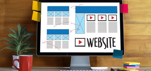
Designer’s desk with responsive web design concept.
Important Trends in Web Design for 2019: Mobile Sites Come First
If you’re out on the town and need to find out where the nearest shoe store is, what do you do? You search for one on your phone, of course.
Nowadays, almost everyone has a smartphone. Among those smartphone users, each person will check their phone about 80 times a day.
Back in 2016, 60% of users used their phones to do searches rather than use their computer. Today, trends in web design are all about mobile-friendly layouts. Design engineers are taking what makes a website great and making it work for your phone.
If you have a website, you need to jump on this trend. If not, you could be losing customers.
Single Page Designs for Simplicity
Not only are customers searching on their phones, but they also want that information on one page.
Enter the Single Page Site. Instead of separate pages or blog categories, you have everything listed on one page.
There has been some pushback with this design. After all, how are you going to make your site SEO optimized when there’s only one webpage?
On the other hand, single page designs mean there’s less information to load. This makes your site faster, which Google loves.
Businesses also like the conversion rates that happen with pageless sites. When everything on your page is leading to one goal (sales), customers are less distracted.
Video Backgrounds to Grab Your Attention
We all love an eye-catching graphic, but you know what makes audiences stop and pay attention? Videos.
Take Facebook for example. They started auto-playing their video ads as a way to grab the audience’s attention. It might seem annoying to some people, but the numbers show that this tactic is working.
Video backgrounds on the top of your page will keep visitors there longer. If you use the power of storytelling, video backgrounds can change the game for your company.
Take a look at this company to see how video grabs your attention and creates a story.
Geometric Shapes Say a Thousand Words
The use of geometric shapes isn’t exactly a new trend. Companies have been using “shape psychology” to create visual stories for years.
If you’re looking for a new way to advertise in 2019, go back to the basics. Use geometric shapes and colors to create a unique design for your site.
Moving Photos…and We’re Not Talking About GIFs
Nothing against GIFs, of course. The GIF keyboard might be the greatest update to social media since the invention of emojis.
The problem with using gifs on your site is that they become repetitive. Instead, create visual interest using cinemagraphs.
Cinemagraphs are photos that mix still and moving images. An example would be a photo of steaming hot soup, but the only thing moving is the steam. That photo would be a great advertisement for a restaurant, plus it loads faster than a video.
Icon Library
Did you ever look at Egyptian hieroglyphics and think, “Man, that is much easier to understand”?
You’re not alone. One of the trends in web design is the rise of icon libraries. Instead of only using words on your site, companies are creating little icons as well.
These icons add visual interest and give the viewer even more of an idea about your brand. That’s a win-win for everyone!
The Hamburger Menu is Here to Stay
With the growing focus on eye-catching visuals and mobile-friendly marketing, it’s no surprise that 2019 is embracing the hamburger menu.
The hamburger menu is the icon with three horizontal lines at the top of your site. Visitors click on the icon if they want to navigate their way around your site.
Some visitors don’t know what the hamburger menu is. If that’s something you’re worried about, put the word “Menu” next to the icon. Problem solved!
Switch Things Up with Asymmetrical Layouts
People crave visual order. That’s why grid layouts are so popular.
One of the new trends in web design is to take that grid and tilt it a few degrees. That way viewers still have order, but it’s more interesting to look at.
Asymmetrical layouts are an easy way to stand out without confusing your audience.
Clean Out the Clutter with a Flat Design
Minimalism is bowing out in the home decor world, but it’s getting started in web design.
There are two major advantages to a minimalist flat design. The first is that your loading time gets cut in half. When you don’t have to worry about all the bells and whistles on your site, it’s easier to load.
The second is that flat designs are automatically mobile-friendly. Again, when your site has nothing but the essentials, it’s easier to load on a smartphone or tablet.
With that in mind, flat designs don’t have to be boring. Use colors, asymmetrical grids, and well-placed photos to create visual interest for your audience. You can hire clay global is UI/UX design and branding agency in San Francisco for creating flat designs.
Trends come and go, but web design trends can help grow your business. Don’t be afraid to branch out and see what new things you can do with your site.
Looking for More Great Web Design Content?
If you liked this article on trends in web design, then you’ll love our other posts. Take a look at our Web Design articles to improve your marketing and site speed.
Don’t forget to check out our Typography section as well! Your font can say a lot about your business, so don’t leave it out of your website design.
Your site is one of the most important parts of your business. That’s why we want to help you make it better.


