
One of the creative ways to display navigation in a site is by a tiled style. Not just it would make a trendy flat design menu it will also add value to your site when you make it responsive using CSS3 Media Queries.
In this tutorial, we are going to create a tiled responsive tiled menu using CSS3 and jQuery. We’ll target 3 viewports here: 1024px, 768px and 480px.
Without any further ado, let’s get started.
Resources you need to complete this tutorial
- jQuery Library
- Font Awesome Icons
- Basic Knowledge about CSS3 and jQuery
- Time and Patience
Getting Started
Before we move on to the markup we need to add the following codes below on our head section. This will include some meta tags, links to our CSS, jQuery and Fonts.
<!DOCTYPE html>
<html lang="en-US">
<head>
<meta charset="utf-8">
<meta name="viewport" content="width=device-width, initial-scale=1.0, maximum-scale=2.0"/>
<title>Creating a Responsive Tiled Menu with CSS and jQuery</title>
<link href="css/reset.css" rel="stylesheet" type="text/css">
<link href="css/style.css" rel="stylesheet" type="text/css">
<link href="css/media-queries.css" rel="stylesheet" type="text/css">
<img src="data:image/gif;base64,R0lGODlhAQABAIAAAAAAAP///yH5BAEAAAAALAAAAAABAAEAAAIBRAA7" data-wp-preserve="%3Cscript%20src%3D%22js%2Fjquery-1.11.1.min.js%22%20type%3D%22text%2Fjavascript%22%3E%3C%2Fscript%3E" data-mce-resize="false" data-mce-placeholder="1" class="mce-object" width="20" height="20" alt="<script>" title="<script>" />
<link href='http://fonts.googleapis.com/css?family=Open+Sans:300italic,400italic,600italic,700italic,400,300,600,700' rel='stylesheet' type='text/css'>
<link href="http://maxcdn.bootstrapcdn.com/font-awesome/4.1.0/css/font-awesome.min.css" rel="stylesheet">
</head>
The Markup
For our responsive tiled menu, we will simply include links inside an unordered list wrapped within a nav tag. Using the unicode ☰, we will have a toggle button that will display our tilled menu on smaller screens.
We will also add font-awesome icons for each item menu using the font-awesome classes. Please refer to this page if you want to use some other icons.
Check out the HTML below.
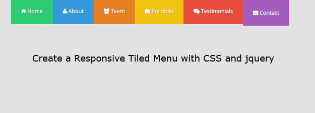
<nav class="nav-bar"> <div class="nav-container"> <a id="nav-menu" class="nav-menu"> <span>Menu</span> ☰ </a> <ul class="nav-list " id="nav"> <li> <a href="#" id="colour-1"><i class="fa fa-home"></i> Home</a></li> <li> <a href="#" id="colour-2"><i class="fa fa-user"></i> About</a></li> <li> <a href="#" id="colour-3"><i class="fa fa-users"></i> Team</a></li> <li> <a href="#" id="colour-4"><i class="fa fa-suitcase"></i> Portfolio</a></li> <li> <a href="#" id="colour-5"><i class="fa fa-weixin"></i> Testimonials</a></li> <li> <a href="#" id="colour-6"><i class="fa fa-envelope"></i> Contact</a></li> </ul> </div> </nav>
The CSS
Now let’s turn our boring markup into something lively. To start off, we will put our general styles first for our links and body background.
body {
    font-family: 'Open Sans', sans-serif;
    background: #e2e2e2;
}

a {
    text-decoration: none;
}
Now let’s some width settings for our nav-container and the container class. We will set the width in a percentage measurement with a 95%. Then give it a maximum width of 1000px. Finally, center it on the screen.
.nav-container,.container {
    width: 95%;
    max-width: 1000px;
    margin: 0 auto;
}
Next, we will style the remaining tags. These will include our styles for our logo, nav-bar class, the links as well as other id’s and classes.
.nav-container,.container {
    width: 95%;
    max-width: 1000px;
    margin: 0 auto;
}


/*NAVIGATION */
.nav-bar {
    width: 100%;
    background: none;

}

.nav-container {
    overflow: hidden;
}


.nav-logo:hover {
    color: #09d9ff;
}

.nav-list {
    margin: 0 auto;
    width: 83.7%;
}

.nav-list li {
    float: left;

}

.nav-list li a {
    display: block;
    color: #f9f9f9;
    text-shadow: 1px 1px 3px rgba(150, 150, 150, 1);
    padding: 30px 30px;
    font-size: 1em;
    -webkit-transition:all 0.3s linear;
   -moz-transition:all 0.3s linear;
     -o-transition:all 0.3s linear;
        transition:all 0.3s linear;
}

.nav-list li a:hover {
-webkit-filter: brightness(1.2);
    padding-top: 60px ;
}

.nav-menu {
    display: none;
}
Notice that I used the new CSS3 property transition. This will simply add a smooth animation transition on mouse-over state at duration of 0.3 seconds and a transition effect with the same speed from start to end.
Now, let’s add the unique colors for each menu item.
#colour-1 {
    background:#2ecc71
}

#colour-2 {
    background:#3498db
}


#colour-3 {
    background:#e67e22
}


#colour-4 {
    background:#f1c40f
}

#colour-5 {
    background:#e74c3c
}

#colour-6 {
    background:#9b59b6
}
The Media Queries
Now to make our navigation responsive, let’s add some media queries to target the 768px and 480px viewport.
/*IE10+ VIEWPORT FIX */

@-ms-viewport {width: device-width;}
@viewport {width: device-width;}


@media screen and (max-width: 768px) {


.nav-list li {
    float: left;
    width: 50%;
}


.nav-list li a:hover{ padding-left: 20px;
    padding-top: 30px ; }
}


@media screen and (max-width: 480px) {
.nav-menu{
	color: #fff;
	float: right;
	display: block;
	padding: 20px 10px;
	cursor: pointer;
}

.nav-list{
float: left;
width: 100%;
overflow: hidden;
height: 0;

}

.nav-container,.container {
    background:#34495e
}

.nav-open {
    height:auto
}

.nav-list li {
    width:100%
}

.nav-list li a:hover {
    padding-top:60px;
    padding-left:30px
}


}
We will give it a width of 50% for each item on 768px viewport. This will form a tilled navigation on our menu. Notice that on 480px viewport, we set up a class nav-open. This will give a height to our menu list when the menu list icon was clicked. We also give our nav-list a width of 100% to make sure that they will collapse on each other starting on 480px.
The Script
Now to finish off our tilled responsive menu, we will add our jQuery below before the closing of tag. This jQuery code will simply select the list of menus and add the class nav-open to give it a height of auto and then slide down to display the navigation by 300 milliseconds duration.
<img src="data:image/gif;base64,R0lGODlhAQABAIAAAAAAAP///yH5BAEAAAAALAAAAAABAAEAAAIBRAA7" data-wp-preserve="%3Cscript%3E%0A%24(document).ready(function()%7B%0A%09%24('%23nav-menu').click(function()%7B%0A%09%09%24('ul.nav-list').addClass('nav-open').slideToggle('300')%3B%0A%09%7D)%3B%0A%7D)%3B%0A%3C%2Fscript%3E" data-mce-resize="false" data-mce-placeholder="1" class="mce-object" width="20" height="20" alt="<script>" title="<script>" />
Wrapping Up
Congratulations! You just created a good looking tilled responsive menu with modern flat design.
Please feel free to play around with different animation techniques and designs you want to add on it.
Hope you learned from this tutorial and let me know about your thoughts or if you have other ways that you’ve come up with to do the same menu, I am interested. Just drop by on the comment box.