Today I would like to speak about a Slider Plugin that I am using for a month and I am sure that it worth to be presented to other website builders as well. Actually, any kind of a slider (video or image) makes a website more attractive, dynamic and well-organized. It reflects the overall content of a website in the very compact and economical way. A slider plugin can take a responsibility for leaving the first impression on a visitor who is getting acquainted with a website first time.
Besides, it can be used together with other plugins, dependent of the purpose of a website. For example, I am using this plugin together with a Product Catalogue plugin, because I have an online store of clothes, shoes and accessories. The plugin is full with interesting and beautiful transition types, which makes is dissimilar from others. And the name of the plugin is —
Slider – Responsive Slider plugin.
In general, any kind of slider plugin makes a website more dynamic, modern and attractive. Slider, which is added to a page (home, product or anywhere else) influences on the opinion of website visitors because especially a slider leaves first impression of it overall. So why creation of an amazing slider for a website visitors is a significant mission. Let’s discover how this mission should be reached and done.
First, it is necessary to upload the plugin to the WordPress panel. In order to upload a free version of the plugin it is vital just to write “Responsive Slider” in the search bar. Then press install now and activate. A green little icon will appear at the left of WordPress dashboard.
Let’s go to its options and see what is hidden under that little green icon of the Responsive Slider plugin. This plugin is not similar to others, because it has easiest way of using. Everything is situated in the panel, where the user is going to work for the creation of a slider.
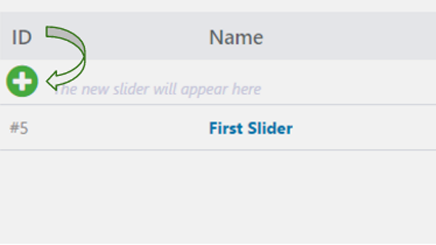
“Plus” button shown in a screenshot, prompts that this is the right place, from where an engaging way of creation of a slider will start. After pressing a button a working panel will be opened.
Thus, as in any other plugin related to the images it is necessary to upload them from the media library and only then to the plugin itself. When this is done, they will appear on the working panel of a Responsive Slider plugin. As for me, it’s wonderful that this Slider gives an opportunity to edit each image separately.
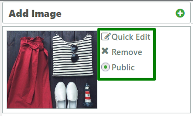
Separate slides’ editing function is composed of three options: quick edit, remove and public. The function of remove is more then clear, it deletes the entire image. Public function makes an image (slide) available for all visitors or just hides it from them. The edit function includes title and description of the image.
Right next to it, there are general options, arrows, bullets, thumbnails, bullets and shortcode sections.

The most important part of general options is width and height of a slider. Ideally, it will be good if the images seizes coincides with that particular slider’s width and height, because in this case the images will look very beautiful. However, this option is customizable and it is possible to adopt it to images.
There are 5 types of arrows. As for me, a decision of which arrow to use completely depends on image and website design overall.

I prefer to use the most neutral second one in order not to distract visitors from clothes and accessories. Besides, I chose the option show on hover, which allows arrows appearing only while hovering on image. There is possibility to show arrows constantly or don’t show them completely.
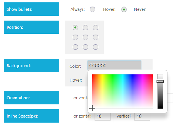
Right next to the arrows there is “Thumbnail” option. This option is responsible for the thumbnails, which should be shown on a slider or not, according to a website creator’s taste. The next is “bullets”. They play the same role as the arrows does, but the advantage of them is that they give an opportunity to view the images on the order which a visitor wishes. For example: he/she can view first image then the last one and then the third image. This bullets’ appearance are customizable. It is possible to change their background and hover color, position, orientation, a distance between bullets and so on.
About the shortcode, I’ll speak a little bit later. When the whole work will be done.
I skipped the part of the transitions from the general options in order to speak about them here, separately. I don’t know exactly how it will be possible to show the effects of movement in the static screenshots but however I’ll try to do it. This plugin has a great advantage among other slider plugins that I have tested before coming across to this. It is a preview function, which gives an opportunity to preview the work and correct mistakes before publishing it. While in the case of other plugins, it is possible to look at the demo or just post a slider every time and see the results.
So, the first view is “Fade”. It is very simple and well known view. Just one image disappears and the next one appres.
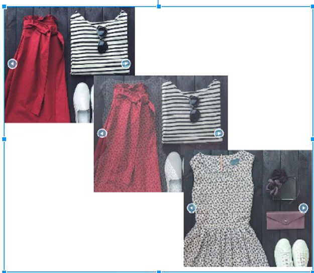
The next one is “Rotate”. It is similar to the previous one, but the previous image disappears when it starts to rotate. Another interesting view is “Switch” view, which is very attractive. I compare it with the following action. Imagine that a person is reading a paper the pages of which are not fixed together. A reader passes through pages, read a page – put on another, read and put constantly.
The next one is “Doors” view. This is working just like any supermarket’s door is. Such kind of doors consists of two parts and they are opening automatically when a person come near a door. The slider is opening a door automatically when another image come near it.
“Switching Axis down” view is like viewing real photographs, taken from the old and rare album. I just tried to explain how does they work by words and comparing with real facts from life, because these all views are a little bit difficult to show with screenshots, as they all seems to be similar to a fade view. It will be great if while reading this part of a post, the explanation will create some kind of imaginary view and after testing a plugin the user can see if his/her imagination and reality coincide or not.
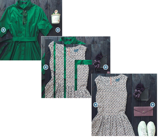
And the last one is “Collapse stairs” view which has an interesting appearance as its name is. It just divides an image into several squares in order to give an opportunity to a next one to appear.
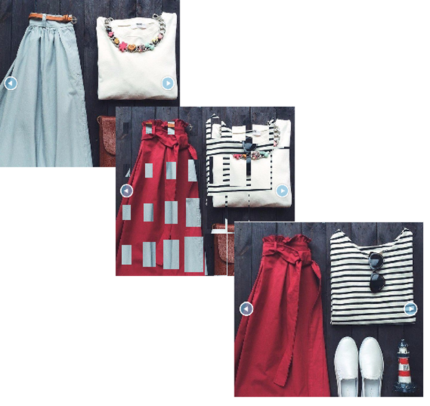
So, these are all views which are presented in this slider and all they have only one aim, that is to attract visitors and force them to pay attention to a website.
And the last option of a Responsive slider, about which I would like to speak is a link button.
Clickable images is very vital tool for directing a visitor just by clicking on an image. This option is included in different slider plugins, but a Responsive Slider stands out with its uniqueness. In the this plugin images cannot be clickable but instead a link button can be used. Let me try to explain why a button option is more effective than just a clickable image.
When a visitor comes across with a slider added at the header of your website first, he/she doesn’t know they images can be clickable. But how they could know? Nohow. But on the contrast, at the corner of same image, will be displayed a little beautiful attractive button, surely, a visitor will click on it and will be directed to a certain page or post which a website creator prepared for them.
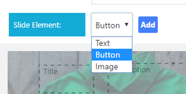
In order to add a button to a specific slide, first it is necessary to click on it for working on that slider only. Then, an “Add” button will allow adding a title, text or button to the image.
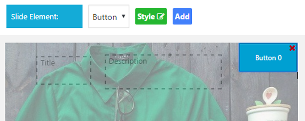
When a button option is selected a “style” button will appear just next to it. It gives an opportunity to change the style of each separate button. Below, it is shown how the button looks by default.
The popup of customizing style includes the following options: button URL, background color, hover color, opacity, border, border colour, border radius, font size and font color. All these options, gives an opportunity to create a button which is suitable to a single image. It is important to create a kind of button, which will not distract visitors from the main image, but will complement it and make it “senseful” and “smart”.
A button, like a slider itself, has a preview option, which will show how a button is changed and how does it look now. What refers the URL, it will not work at the preview, because it is necessary to insert a slider to a post or page first and only then it will be obvious how the link is working. In my case, I added a link to the product page and when a visitor first get acquainted with my page (where a slider is added) he/she can immediately go to the product page, if he/she is interested in a product.
Later, they will see the whole range of product at that page, which are not presented in the slider as well as a details of the products which are included in a slider. It’s very easy to move a button with just drag and drop functionality (slides’ order is working according to this feature as well). Also, it’s possible to change a text of the button just clicking on default name and writing a new one.
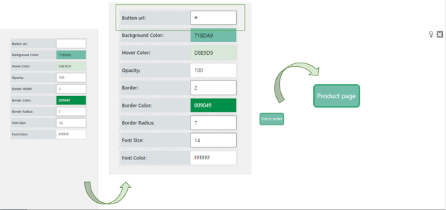
Overall I got the following result. I think the button looks pretty good and without any doubt will attract visitors and let them click on it. For different slides I have created different buttons.
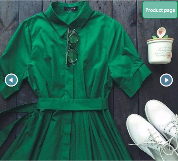
When all the components of a successful and amazing slider are gathered together it is a right time to leave it to an audience’s judgement. In order to do this, just take a shortcode from a “Shortcode” option about which I have mentioned at the beginning of this post, copy it and paste to post, page or theme. That’s all, the work is done!

The feedbacks, which I am getting from visitors of the website are very pleasant to hear. I feel happiness when I get them, because I understand that the work I am doing is not useless. The website just not provides visitors with clothes or accessories, but also gives them an opportunity and motivation to try to create such kind of website on their own. And the biggest amount of questions that I am getting from visitors is related to the slider plugin which I am using. At such moments I understand that I have one more mission, that is sharing my experience with other website creators in order to give them an opportunity to try on their own and feel a delightfulness of being appreciated and respected.

