CSS provides many advantages towards accessibility, as well as providing the ability to custom-tailor a page or site for various target devices; which- despite certain devices not being able to understand the styling, they will still go onto displaying the content.
CSS preprocessors process text file, and output exact CSS what we need. Exactly what that text file contains depends on the individual preprocessor, but both SASS and LESS are a superset of CSS. They include everything already in the CSS specification plus additional features. A major benefit of which is that if you know CSS, you can already write valid LESS and SASS, and just need to learn a few extra tricks.
In this article we have gathered a list of CSS Frameworks built with Sass CSS preprocessor, that will help you to build dynamic web application quickly and without any hassle.
1. Bootstrap
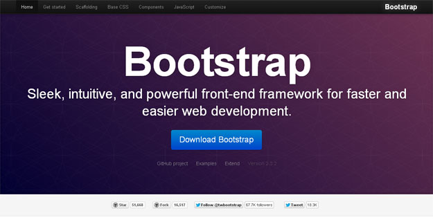
Bootstrap is a sleek, intuitive, and powerful front-end framework for faster and easier web development, created by Mark Otto and Jacob Thornton, It is built with Less and Sass and consists of base CSS + HTML for typography, forms, buttons, tables, grids, navigation, and some more. The grid provided is 940px wide 16-column and, for the layouts, there are solutions for both fixed + fluid ones. Twitter Bootstrap’s HTML elements have a plain-yet-elegant style where form inputs get a nice box-shadow on focus or table rows being highlighted.
2. Foundation
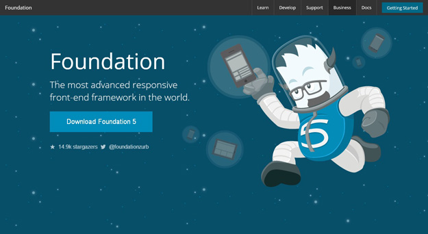
Foundation 3 is built with Sass, a powerful CSS preprocessor, which allows us to much more quickly develop Foundation itself and gives you new tools to quickly customize and build on top of Foundation.
3. YAML
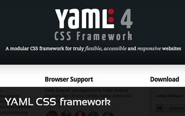
YAML is a modular CSS framework for truly flexible, accessible and responsive websites. The framework is focussed on device independent screen design and provides bullet-proof modules for flexible layouts. Apart from this, the developer of YAML Dirk Jesse has come up with this framework keeping into mind the web standards. In addition, this CSS framework comes complete with a YAML Builder.
4. 1kb Grid
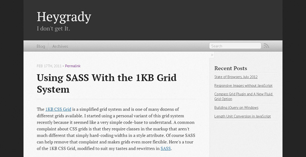
Simple grid system inspired by the the 1KB CSS Grid designed to utilize Sass to remove unnecessary classes from the HTML markup and make customization easier. The best part is that it’s not exactly 1KB now! Even better than the best part is that it’s been extended to support fluid grids as well.
5. xCSS
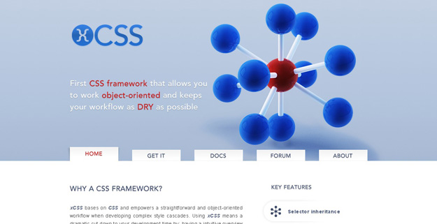
xCSS bases on CSS and empowers a straightforward and object-oriented workflow when developing complex style cascades. Using xCSS means a dramatic cut down to your development time by: having a intuitive overview of the overall CSS structure, using variables, re-using existing style cascades and many other handy features.
6. Helium
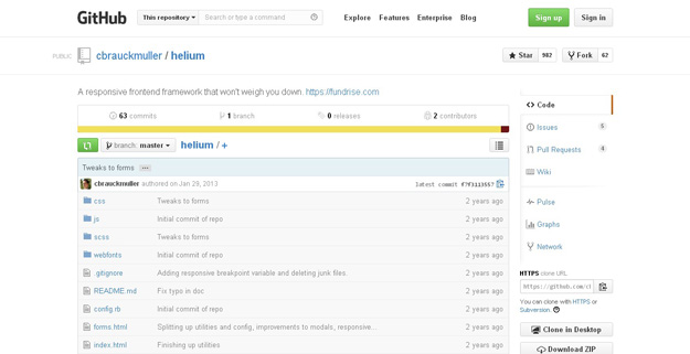
Helium is a frontend responsive web framework for rapid prototyping and production-ready development using HTML5 and CSS3. In many ways it is similar to both Twitter Bootstrap and ZURB Foundation – in fact, it uses bits of their code. Unlike either of these two frameworks, however, Helium is designed to be much more lightweight and easier to tinker with.
7. Groundwork CSS
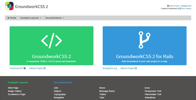
GroundworkCSS’s flexible grid system enables you to do rapid development and scales to fit any screen size, from handheld devices to large format televisions.
8. Gumby
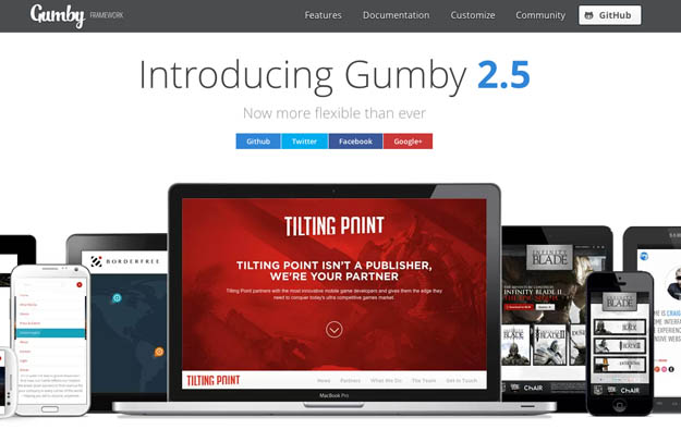
Gumby Framework is a flexible, responsive CSS Framework, Powered by SASS. Create rapid and logical page layout and app prototypes with a flexible and responsive grid system and UI kit. It is built with the power of Sass. Sass is a powerful CSS preprocessor which allows us to develop Gumby itself with much more speed — and gives you new tools to quickly customize and build on top of the Gumby Framework.
9. Unsemantic
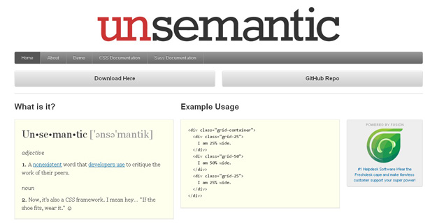
Unsemantic is a fluid grid system that is the successor to the 960 Grid System. It works in a similar way, but instead of being a set number of columns, it’s entirely based on percentages.
10. Maple

Realistic preprocessors-based CSS framework for mobile.
11. Kickoff
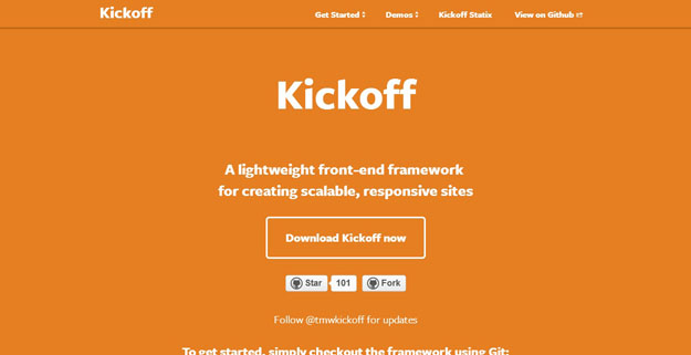
Kickoff is a lightweight front-end framework for building scalable, responsive websites. It’s built with Sass and Grunt, and released under the MIT License.
12. Susy
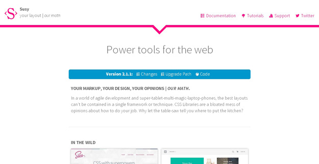
The web is a responsive place, from your lithe & lively development process to your end-user’s super-tablet-multi-magic-lap-phone. You need grids that are powerful yet custom, reliable yet responsive.
13. Inuit.css
Inuit is a Sass based, Object Oriented framework that is full of objects and abstractions. inuit.css provides little-to-no design which means no undoing things, no deleting CSS and no adhering to other peoples’ design decisions.
14. Seelva
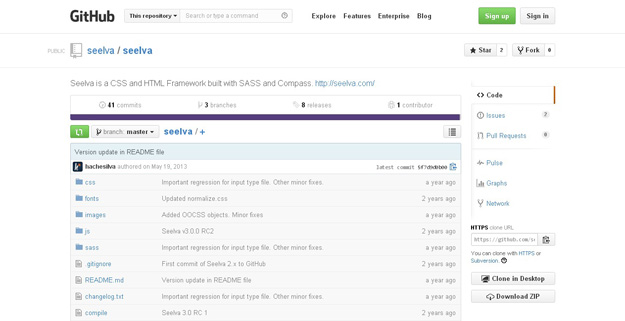
Seelva is a CSS and HTML Framework built with SASS and Compass. It features a fixed 960px 24 columns grid that can be modified through SASS.
15. Bourbon Neat
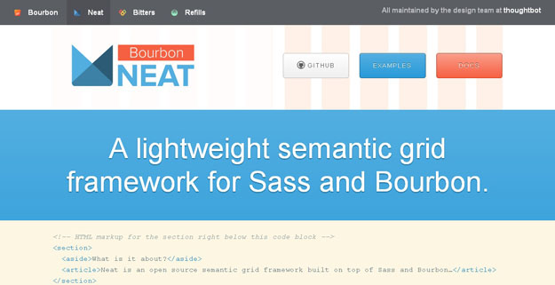
Neat is a semantic grid framework built on top of Sass and Bourbon. It is simple enough to get you up and running in minutes, and powerful enough to handle any responsive layout you can dream of.

