One of the latest requirements regarding web design during the last few years is Responsiveness. This has presented Web designers with a greater challenge, as they are now required to create and render web pages by which to provide an optimal viewing experience, easy reading as well as navigation with a minimum of re-sizing, panning, and scrolling – across a wide range of devices.
Responsive web designed Websites adapt the layout to the viewing environment by using fluid, proportion-based grids, flexible images, and CSS3 media queries, an extension of the @media rule. Flexible images are also sized in relative units, so as to prevent them from displaying outside their containing element – which is definitely a requirement when endeavoring in creating any Responsive website.
There are always concept calls for page element sizing such as : whether it should be in relative units like percentages, rather than absolute units like pixels or points, however, these are minor issues – and creating a responsive website is not that difficult an endeavor if one is equipped with the proper set of tools at their disposal.
Creating a Responsive site is becoming easier and attainable for nearly every website owner and anyone who is not a certified “code expert”. With the use of jQuery, users now have at their disposal a sufficient number of responsive design plugins by which to implement and utilize in order to achieve desired Responsiveness within their websites.
We have carefully collected a well-categorized list of for our users and designers alike by which to make your undertaking at creating responsive web design a much simpler process- and to help you achieve desired results within a more efficient manner. In this list of jQuery Responsive Plugins, you will find that you can now make your images, navigation menus and sliders as well as light-boxes to render responsive across all devices, and your content displayed to perfection!
Enjoy!
Grids, Layout and Tools
1. Match Height
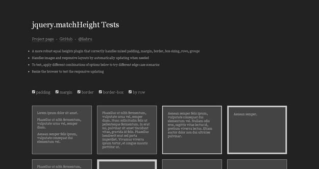
matchHeight is a more robust, responsive equal heights plugin for jQuery. It makes the height of all selected elements exactly equal. It provides row aware, handles floating elements, responsive, automatically updates on window resize, handles images and other media, data attributes API and many more.
2. BttrLazyLoading
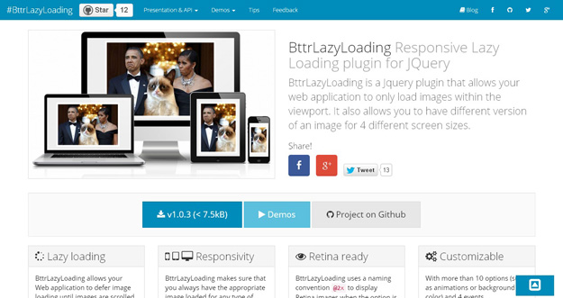
BttrLazyLoading is a jQuery plugin that allows your web application to only load images within the viewport. It also allows you to have different version of an image for 4 different screen sizes. BttrLazyLoading allows your Web application to defer image loading until images are scrolled to. That way the page loading time decreases considerably.
3. Flickerplate

Flickerplate is a cool jQuery plugin that lets you flick through content. It also requires Modernizr for touch detection and the jQuery.Finger library for touch events. Both jQuery and a custom build of Modernizr are supplied.
4. Response
Response is a jQuery plugin that provides tools for building performance-optimized, mobile-first responsive websites. Its breakpoint sets use HTML5 data attributes to dynamically swap markup based on breakpoints so that rich content can be served progressively. Its API includes cross-browser event hooks, HTML5 dataset, and ways to get or test responsive properties.
5. jQuery Responsive Web
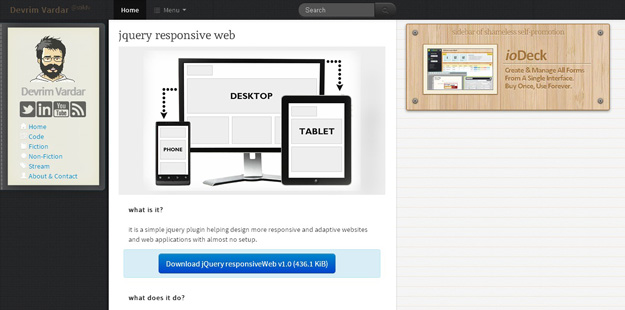
it is a simple jquery plugin helping design more responsive and adaptive websites and web applications with almost no setup. When you resize the window, it automatically changes the window size related class. There are also two functions called, one on init, and the other on resize, so that you can make design manipulations accordingly.
6. jQuery Masonry
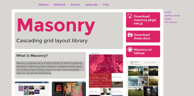
Masonry is a JavaScript grid layout library. It works by placing elements in optimal position based on available vertical space, sort of like a mason fitting stones in a wall. You’ve probably seen it in use all over the Internet.
7. Break Point js
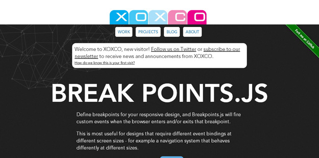
Using this plugin you can define breakpoints for your design, andBreakpoints.js will fire custom events when the browser enters and/or exits that breakpoint.
8. Mobify.js
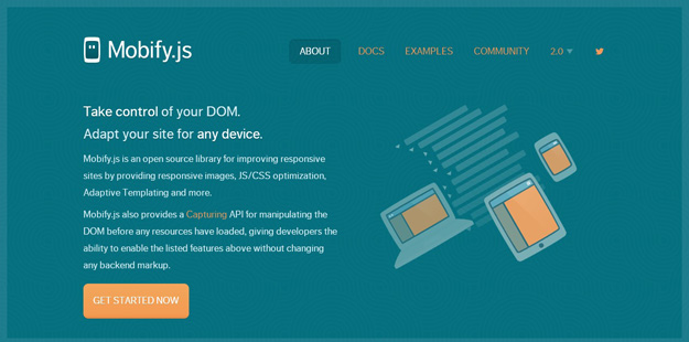
Mobify.js is an open source library for improving responsive sites by providing responsive images, JS/CSS optimization, Adaptive Templating and more. Mobify.js also provides a “Capturing” API for manipulating the DOM before any resources have loaded, giving developers the ability to enable the listed features above without changing any backend markup.
9. Responsive Elements
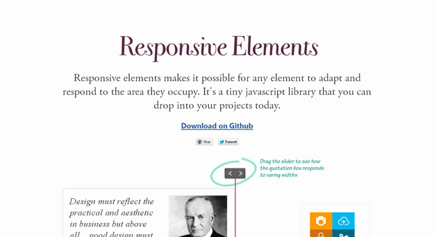
Responsive Elements, a jQuery plugin, makes this process easier for the elements used in a web page. The plugin adds classes (like gt100 lt150 lt200 where gt refers to “greater than” and lt refers to “lower than) to the elements which tell us “how big exactly the size of each element is“.The range of the classes (from x to y pixels) and the interval of them(create classes each z pixels) can be defined too.
10. jQuery Responsive Tabs

Responsive Tabs is a jQuery plugin that provides responsive tab functionality. The tabs transform to an accordion when it reaches a CSS breakpoint. You can use this plugin as a solution for displaying tabs elegantly on desktop, tablet and mobile.
11. Headsup Grid
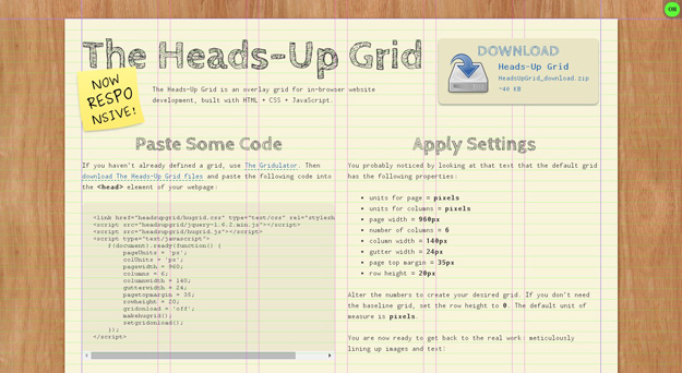
jQuery powered grid gives you chance to set different grid options including padding, columns, page-width (percentage or px), margins and gutter width. With it, you can define different grid experiences depending on the platform and/or window size.
12. Fit Text
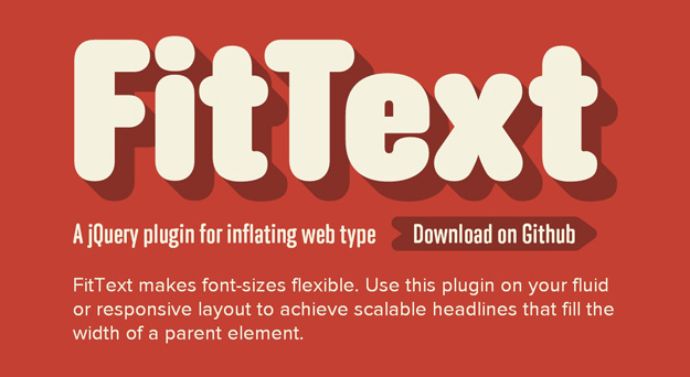
Fit Text makes font-sizes flexible. Use this plugin on your fluid or responsive layout to achieve scalable headlines that fill the width of a parent element. It is not advised for use on paragraphs, but its good-looking for headers especially with font-replacement.
13. FreeWall

Freewall is an impressive jQuery plugin for creating these layouts withCSS3 animation effects. The plugin supports responsive layouts and has useful methods like “adding more items to the grid” or “filtering them”. Various customization options exist like the animation, delay or the gutter sizes. And, Freewall offers callbacks for events like complete, gap found or resize.
14. Scrolld.js
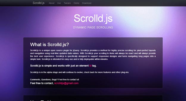
Scrolld.js is a unique open source plugin for jQuery. Scrolld.js provides a method for highly precise scrolling for pixel-perfect layouts and navigation using real-time updated data values. With Scrolld.js your scrolling to items will always be exact and will always provide the best user experience. Scrolld.js is specifically designed to support responsive designs and turns navigating long pages into a simple task. Scrolld.js is intended for easy use and is fully deployable within minutes.
15. Responsive Full Width Tabs
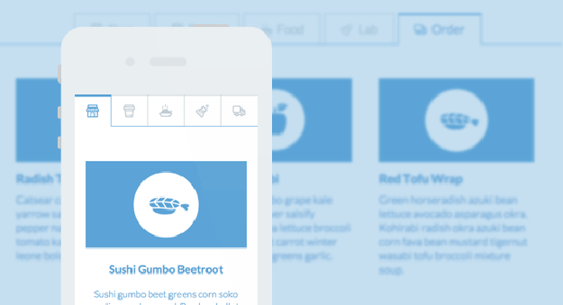
A full width tab component with some example media queries for adjusting the icons of the tabs and the content layout. The main idea is to show only icons for the mobile view and allow the text to appear when there’s enough space. The content columns and the containing media boxes have three different layouts.
jQuery Image Gallery and Sliders
1. Unslider
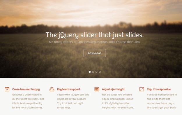
Unslider is the jQuery slider that just slides. No fancy effects or unnecessary markup, and it’s less than 3kb. It’s fluid, flexible, fantastically minimal. Unslider’s been tested in all the latest browsers, and it falls back magnificently for the not-so-latest ones.
2. Ferro Slider
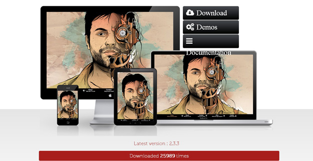
FerroSlider is a jQuery slider for creating full-page sliders (or content/image sliders) of almost any type. The contents can be placed in a flexible way, horizontal + vertical, and the plugin will simplify browsing through them easily. It uses CSS3 transitions for a good performance, works well with responsive layouts and works on mobile too.
3. Flex Slider
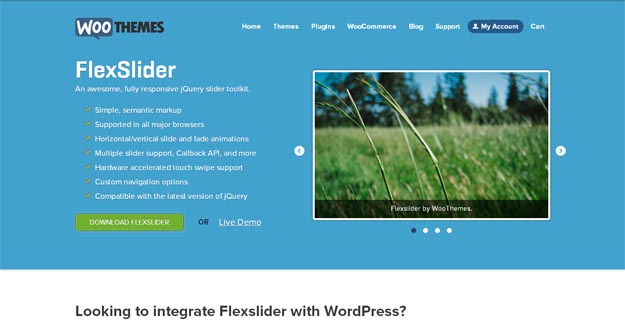
Flexslider is simple and semantic markup jQuery plugin with high resolution support and works on every available browser. The most beautiful feature of Flexslider is, users can navigate the plugin through keyboard, navigation buttons and it also supports touch swipe navigation.
4. uSlider
μslider is a responsive and touch friendly jQuery plugin slider. Content can be anything: images, text, iframes, html5 video and audio (natively), YouTube and Vimeo videos with a light js patch. It’s highly flexible and very easy to configure.
5. Royal Slider
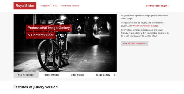
Royal Slider is a jQuery plugin for displaying any HTML content (images, videos, text..) inside a slider interface and comes with awesome features. The slider is very customizable with 50+ options, 4 skins with PSD files, 9 pre-built templates (and more coming) and full CSS styling. It works in all major browsers, the output is responsive down to mobile (touch friendly) and works fast, thanks to CSS3 animations (with JS fallback).
6. Responsive Slides
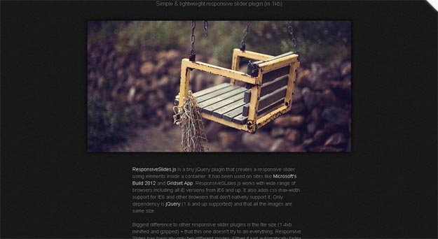
ResponsiveSlides.js is a tiny jQuery plugin that creates a responsive slideshow and works with wide range of browsers including all IE versions from IE6 and up. It also adds css max-width support for IE6 and other browsers that don’t natively support it. Only dependency is jQuery (1.4 and up supported) and that all the images are same size.
7. Slick
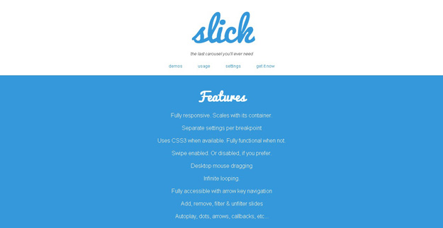
Slick is fully responsive jquery carousel plugins, it provides numerous features such as desktop mouse dragging, infinite looping, fully accessible with arrow key navigation, separate setting per breakout and many more.
8. Venobox
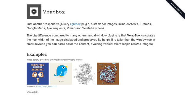
VenoBox is a just another responsive jQuery lightbox plugin, suitable for images, inline contents, iFrames, Google-Maps, Ajax requests, Vimeo and YouTube videos. The big difference compared to many others modal-window plugins is that VenoBox calculates the max width of the image displayed and preserves its height if is taller than the window (so in small devices you can scroll down the content, avoiding vertical microscopic resized images).
9. Responsive Image.js

Responsive-img.js is a lightweight plugin for fast, clean and easy responsive image replacement using to the viewport your visitor’s browser. This way you can reduce the payload for your users by only letting them download the appropriate images for their device.
10. Nano Gallery

nanoGallery is very easy to implement image gallery plugin for jQuery. It is touch enabled, responsive, fast and it supports cloud storage. Featuring multi-level navigation in albums, lightbox, many hover effects on thumbnails, slideshow, fullscreen, pagination, image lazy load, themes, bootstrap compatibility, customizable, i18n, and pulling in Flickr/Picasa/Google+ photo albums among others.
Responsive Navigation Plugins
1. Slim Menu
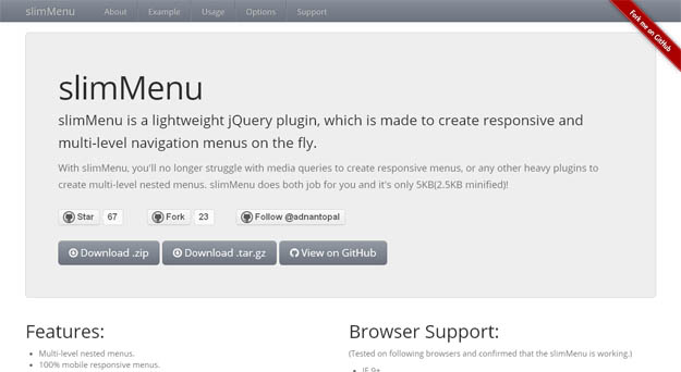
slimMenu is a lightweight jQuery plugin, which is made to create responsive and multi-level navigation menus on the fly. With slimMenu, you’ll no longer struggle with media queries to create responsive menus, or any other heavy plugins to create multi-level nested menus. slimMenu does both job for you and it’s only 5KB(2.5KB minified)!
2. Flex Nav
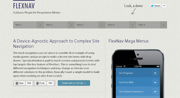
FlexNav is another jQuery plugin for easily handling menus in responsive layouts and it does that well for complex ones too. The plugin has support for unlimited sub-menus that work similarly in both desktop and mobile layouts. It has no-JS fallback, works with keyboard-tabs too (for accessibility) and touch-friendly.
3. Sidr
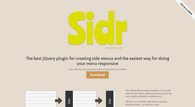
Sidr is a jQuery plugin for creating “hidden side menus” on-the-fly. It can be set to be displayed at right or left, a single page can have multiple side menus and offers multiple methods (existing or remote content) for loading the content. For responsive layouts, a Sidr menu can be attached to a button (that is displayed for specific screen sizes with media -queries) and it’ll be a very handy navigation solution for small screens.
4. Tinynav.js
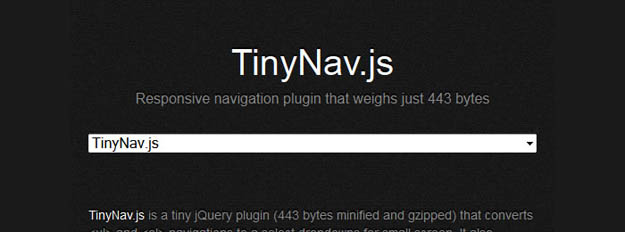
TinyNav.js is a lightweight plugin (362 bytes) that converts ul and ol menus into a select dropdown. It also automatically selects the current page and adds selected=”selected” for that item.
5. SlickNav
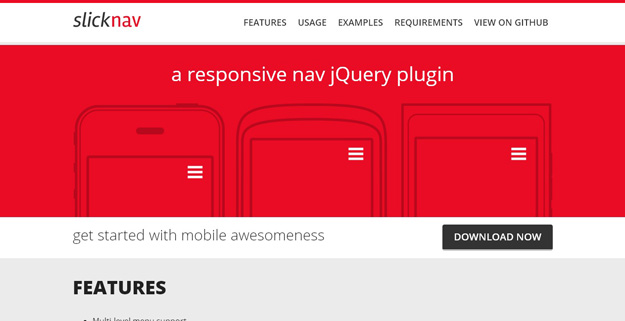
SlickNav is a responsive mobile menu plugin for jQuery. It has number of features such as Supports with multi-level menus, flexible, simple markup, cross-browser compatibility, keyboard accessible and many more.


