When it comes to web design, CSS tools can play a handy role as they serve myriad of purposes for designers and developers from simplifying their work flow to write up better css code.
There are number of css tools are being released and available over Internet which allows designers and developers to work and generate innovative results efficiently. These tools help within achieving good command over CSS which serves as a pivotal factor by which many designers and developers constantly seek to add to their toolbox.
In this article we have compiled a list of Best CSS Tools for 2014 which will help you to simplify your development related tasks and allow you to write clean css codes. We hope you will find the list handy and beneficial for your development needs. Enjoy !
1. Enjoy CSS
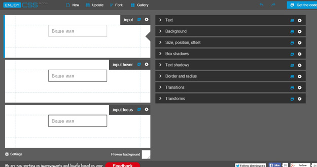
With EnjoyCSS, creating instances for hover, active, and custom class states has never been more simplified than with EnjoyCSS generator. It is one of the many useful CSS tools which every developer and designer should have in their toolbox by which to speed up their work-flow.Its ease of use and simple UI allows one to incorporate rich graphic styles quickly and without coding.
2. Keyframer
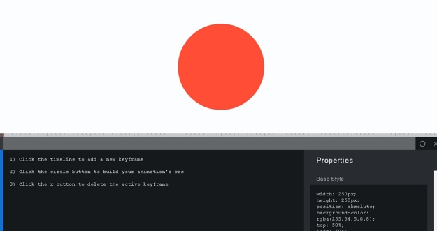
Keyframer is an incredibly easy to use CSS3 animation creation tool. All you have to do is Just click the timeline to add a keyframe, then click the circle button to add your animation’s CSS, or the X button to delete the current keyframe, and test your skills.
3. Wow.js
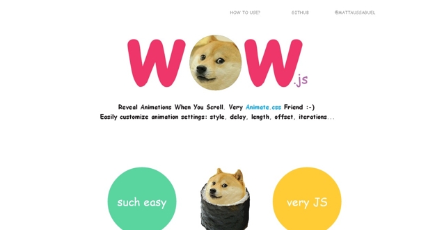
Wow.js enables you to reveal CSS animation as you scroll down a page. By default, you should use it to trigger animate.css animations. But you can easily change the settings to your favorite animation library. It is smaller than other javascript parallax plugins, like Scrollorama (they do fantastic things, but can be too much heavier for simple needs), Super simple to install, and works with animate.css, so if you already use it, that will be very fast to setup, and fast execution and lightweight code: the browser will like it.
4. Jeet
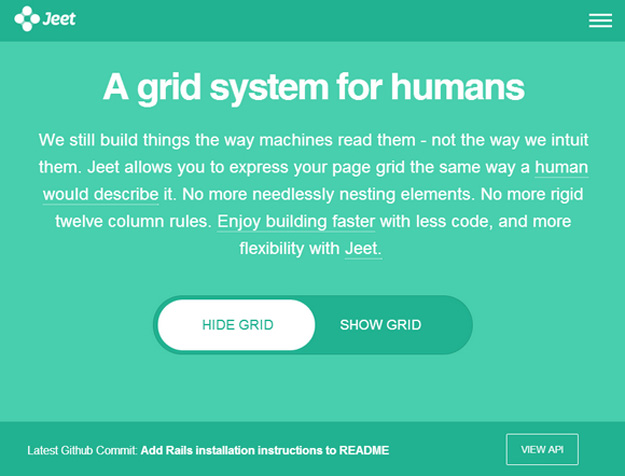
Jeet is the most advanced, yet intuitive, grid system on the market today. You can think of it like the spiritual successor to Semantic.gs. By making use of the power of pre-processors, we can now pass real fractions (or float numbers) as context that generates a percentage based width and gutter for grids. We’re able to do this while maintaining a consistently sized infinitely nestable gutter. Jeet allows you to express your page grid the same way a human would describe it. No more needlessly nesting elements. No more rigid twelve column rules. Enjoy building faster with less code, and more flexibility with Jeet.
5. Gridlover
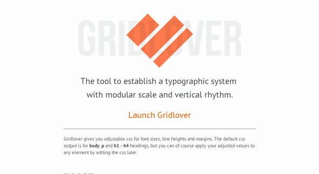
Gridlover gives you adjustable css for font sizes, line heights and margins. The default css output is for body, p and h1 – h4 headings, but you can of course apply your adjusted values to any element by editing the css. Simply drag the numbers in the top toolbar left and right to adjust their value. Elements in Gridlover are always kept aligned to a pixel perfect baseline grid. The font scale in Gridlover is calculated by stepping up the font size by the scale factor for each heading level. Line heights are fitted to the font size.
6. Magic CSS3 Animation
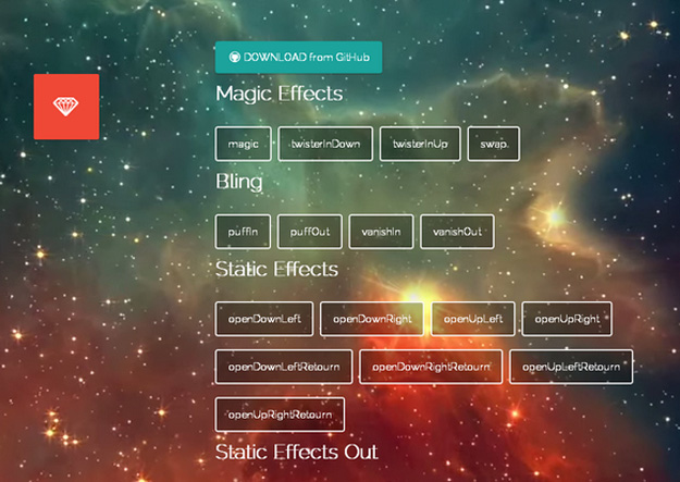
Magic CSS3 Animations is a package of CSS3 animations with special effects that you can freely use for your web projects. Simple include the CSS style: magic.css or include the mynified version: magic.min.css.
7. Refills
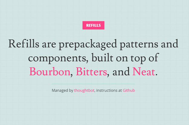
Bourbon provides Sass mixins and eliminates vendor prefixes, for faster CSS coding. Neat provides a lightweight grid framework. Bitters provides basic variables and structure to a Bourbon/Neat project. Refills are prepackaged patterns and components, built on top of Bourbon, Bitters, and Neat.
8. CSS Perf
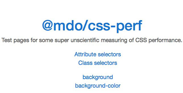
CSS-perf makes it easy to conduct some super unscientific CSS testing on your web pages. For the most part, these tests revolve around methodologies and techniques for determining effective CSS architecture.
9. Progre(c)ss
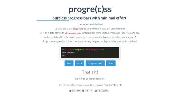
Progre(c)ss makes it easy to create pure CSS progress bars. Just include the stylesheet, add the class to the appropriate element, and then add a data attribute.
10. Normalize.CSS
Normalize.css is an HTML5-ready alternative to browser resets. It will make all elements render more precisely and uniformly across browsers, targeting only the styles that need normalizing by detecting browser defaults.
11. iHOver
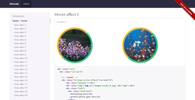
iHover is an impressive hover effects collection, powered by pure CSS3, no dependency, work well with Bootstrap 3. It’s built with Scss CSS (file included), easy modification with variables. There is Modular code, no need to include the entire file.
12. Sublime CSS Completions
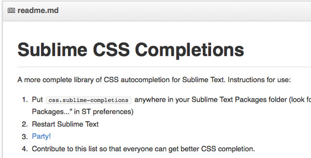
This library of Sublime CSS Completions for Sublime Text is much more complete than those that come standard with Sublime Text. Currently only properties are autocompleted, though at some point in the future valid values may autocomplete as well.
13. Decss
Decss is a mostly CSS-driven presentation framework that uses CSS3 for transitions. It offer responsive layouts, flexbox for content layout, and even supports presenter notes.
14. Imacss
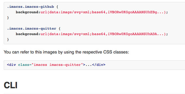
Imacss is a library and application that transforms image files into data URIs, which are then embedded into a single CSS file as background images. Basically, it lets you reduce all of your HTTP requests for images in your design (like icons) into a single call.
15 Fluidity
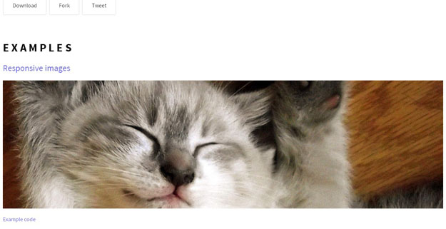
Fluidity is a tiny bit of CSS (107 bytes total) that fixes the part of HTML that isn’t completely responsive. It makes changes to the way images, tables, iframes, preformatted text, and canvas elements, so that they’re completely responsive.
16. Zen Grids
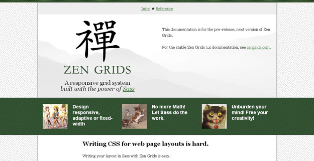
Zen Grids is a responsive grid system built with Sass. It greatly simplifies creating your layout by removing most of the complicated markup you’d need to create responsive grid-based designs with pure CSS and HTML.
17. Progress.js
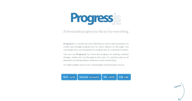
ProgressJs is a JavaScript and CSS3 library which help developers to create and manage progress bar for every objects on the page. You can design your own template for progress bar or customize it simply.
18. Bootflat
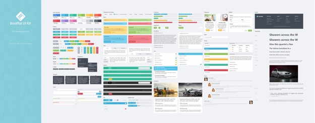
BootFlat is an open source Flat UI KIT based on Bootstrap 3.1.0 CSS framework. It provides a faster, easier and less repetitive way for web developers to create elegant web apps. Bootflat is built on the foundations of Bootstrap, visioned in a stunning flat design.
19. Sculpt
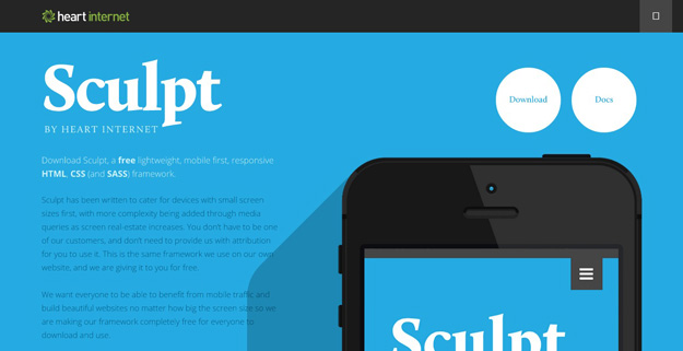
Sculpt is a lightweight, mobile first, responsive HTML, CSS and SASS framework. It has been written to cater for devices with small screen sizes first, with more complexity being added through media queries as screen real-estate increases. With three grid sizes (732px, 960px and 1140px) built in and active depending on your device’s screen size you can be sure your content will be well presented no matter the conditions.
20. Animo.js
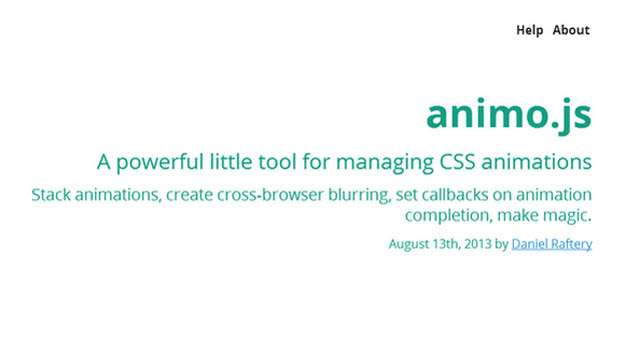
A powerful little tool for managing CSS animations. Stack animations, create cross-browser blurring, set callbacks on animation completion, make magic.
