The world is becoming fast. People do not have time to go through an excessively detailed piece of information. As a result, there comes into existence Brochure. The earlier forms of the brochure were pamphlets and leaflets. Brochures are modes of advertisement and promotion. Companies use the most popular web design styles to highlight the services they provide and mark their excellence in respective fields.
A lot of thought and work is done upon the designing of the brochures. One must be very accurate with the content of data provided. Also, they should be able to cut off the excess data and primarily focus on the main points. Sometimes, people tend to pour in too much effort and as a result, develop a too detailed and complex brochure.

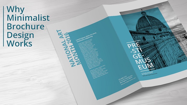
However, this is to be highly avoided. One must always make sure that the brochure is neat, simple, and easy to real. Also, it should highlight the crucial aspects of the company. One must keep in mind that minimum elements tend to provide maximum details. Minimalist design is all about keeping it simple and making the brochure efficient. The brochure plays a very vital role in the process of advertisement.
Hence one must be very aware of what is to be written and how.
1. A minimalist design brochure has a lot of advantages. Every company has its own target audience. Thus, the brochure must be designed keeping in mind the target audience. The brochure must be reader friendly. Thus a minimalist design is advantageous. With this form of design, the company can make brochure which puts the utmost focus on the objective, thereby deleting the unnecessary details. As a result, people will be able to grasp the data more easily and the brochure will be able to serve its utmost purpose.
2. The brochures should be as much user-friendly as possible. One should not make it overcrowded with graphics, designs, pictures etc. Rather stress should be given in order to provide ample gaps between the data. Also, sufficient amount of white space should be left all around the brochure. Using two to three bold colours will serve the purpose. Making it too vibrant and colourful sometimes tends to eradicate the attention of the people from the major aspects.
3. Minimalist design brochures have less amount of contents, wince major focus is to be given on a few aspects of the business. As a result of this, such brochures are very easy to work upon and hence tend to get manufactured at a comparatively faster rate. One does not need to put one image over the other and tweak the graphical options to get the desired effect.
4. But minimalist design is not only about deleting data. There is a lot of effort that has to be put at the planning stage. Conceptualisation of the larger chunk of data is very important. Only after proper conceptualisation can one grasp the situation in hand and able to subtract the unnecessary elements.
5. One of the other major factors that companies look into is the aspect of money. Each and every company wants to sell as less money as possible. Same applies in the case of brochure designing. Companies want the brochure to have a maximum impact at an extremely affordable cost. This is another important place where minimalistic brochure design tends to be advantageous to the company. In this method, the content is cut down to the least amount possible. Also, there is a lot of reduction in the amount of graphics and design. Thu, on a comparative scale, such a design would like to take up lesser space on paper. Also, the minimalistic design suggests the use of two to three solid colours with minimum graphical content, along with a lot of white space. As a result, the company tend to spend less on paper and colour. On the whole, the company is able to extract maximum utility from the minimalistic brochures at a lesser amount.
Thus people should adopt this method brochure design. Not only will it help the cut of the cost but also achieve maximum utility. However major though has to be given while deducting the redundant data.


