A framework is a collection of modules or packages that helps a web developer to build useful and innovative web applications. There are myriad of frameworks are available online which allow you to create dynamic and innovative websites.
You can either go with popular frameworks like Bootstrap or Foundation or you can choose simple and lightweight frameworks to do number of things for you.
There are number of such frameworks available which gives you right amount of styles and components to help you get started.
Here is the list of some of the best Bootstrap Alternative Frameworks which are light and feature enriched and you can use them for building smaller scale websites.
Let’s check out the list.
1. Base
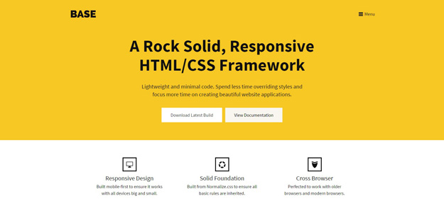
Base is built on top of LESS and Sass, and it includes only the most essential of components to build websites: the grid and the basic styling of HTML elements. It is lightweight and minimal code. Spend less time overriding styles and focus more time on creating beautiful website applications.
2. Pure.css
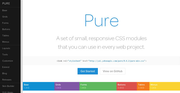
Pure is a set of small, responsive CSS modules that you can use in every web project. Pure is ridiculously tiny. The entire set of modules clocks in at 5.7KB minified and gzipped, without forgoing responsive styles, design, or ease of use. Crafted with mobile devices in mind, it was important to us to keep our file sizes small, and every line of CSS was carefully considered. If you decide to only use a subset of these modules, you’ll save even more bytes.
3. Skelton
Skeleton is a small collection of CSS and JS files that can help you rapidly develop sites that look beautiful at any size, be it a 17″ laptop screen or an iPhone. The new Skeleton grid system now adopts mobile-first philosphy, which ensures that the layout takes center stage regardless of how small the device screen is.
4. Cardinal CSS
Cardinal is a modular, “mobile-first” CSS framework built with performance and scalability in mind. The purpose of this framework is to make it easier for front-end web developers to prototype, build, scale, and maintain CSS for responsive websites, user interfaces, and applications.
CardinalCSS also comes with a handful of helper classes that allow you to quickly apply styles upon an element, for example, the drop-cap which applies the drop-cap effect for the first character in the paragraph.
5. StringBean
The featherweight responsive CSS Framework based on a 16-point system, rather than the traditional 12-point system that other frameworks use. Sometimes, 12 is just too few, especially on a high resolution screen, such as 4K – at 4K String Bean comes into its own! This gives the developer the power to divide the screen up in more finite segments providing you with greater control over the widths of content on your site, especially at higher resolutions (think HD & UHD (2K, 3K, 4K, and above).
6. Furtive
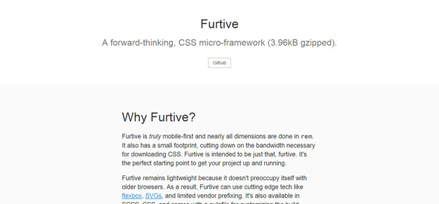
Furtive is truly mobile-first and nearly all dimensions are done in rem. It also has a small footprint, cutting down on the bandwidth necessary for downloading CSS. Furtive is intended to be just that, furtive. It’s the perfect starting point to get your project up and running.
Furtive remains lightweight because it doesn’t preoccupy itself with older browsers. As a result, Furtive can use cutting edge tech likeflexbox, SVGs, and limited vendor prefixing. It’s also available in SCSS, CSS, and comes with a gulpfile for customizing the build.
7. Milligram
Milligram is a minimalist CSS framework. Its lightweight (only 2kb gzipped!), and is designed for better performance and productivity.
8. Tuktuk
TukTuk is a responsive 12-colum grid framework with plenty of flexibility. It’s suitable for blogs, landing pages, profile pages, and web apps, among other types of sites.
9. BassCSS
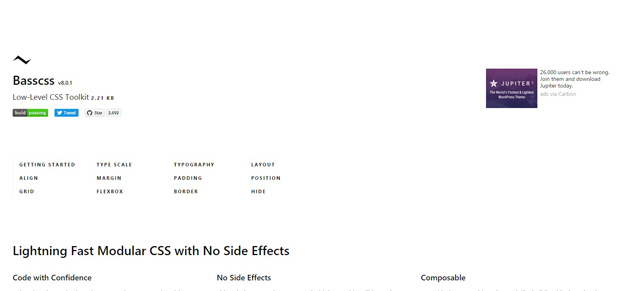
BassCSS offers a lightweight set of base element styles, utilities, layout and color styles, in modular form for buildilng a responsive web application. Basscss strikes a balance between consistency and flexibility to allow for rapid prototyping and quick iterative changes when designing in the browser. It is reusable, interoperable styles work like building blocks to lay the foundation for any stylesheet and can be mixed and matched in any number of combinations.
10. Mueller
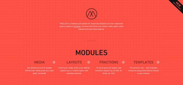
MUELLER is a modular grid system for responsive/adaptive and non–responsive layouts, based on Compass. You have full control over column width, gutter width, baseline grid and media–queries. Mueller grid can be used in tandem with the Masonry Javascript library to create a Pinterest-like layout.
11. ConciseCSS
Concise is a front-end CSS framework that has a number of preprocessors built-in, including Vanilla CSS, SASS, and LESS. It’s mobile-first and includes tons of components like buttons, drop-downs, and more.
Similarly, ConciseCSS also comes with base styles for essential elements such as the headings, paragraphs, tables, forms, and a set of helpers class to create button UI.
12. Layer CSS
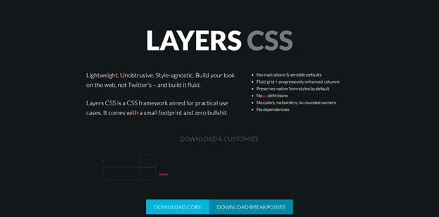
Layers-CSS is an unobtrusive, style-agnostic, lightweight framework. It has a small footprint and a minimum-interference collection of common-sense default styles.
