When it comes to the world of web design, one of the best straightforward definitions of a framework is defined as a package which is comprised of a structured set of files and folders of standardized code (HTML, CSS, JS documents etc.) and is utilized within supporting the development of websites, as being the basis to begin creating or building a site.
Usually, most websites tend to share a similar – but not necessarily an identical structure. However, the aim and overall purpose of frameworks is : to provide a common structure whereas developers will not be required in having to re-create a new one from scratch and can reuse the code provided. Within this manner, frameworks allow us to eliminate much of the work and the end result is: Time Saved.
Inasmuch, the concept of a framework can be applied to various processes which are carried out on the web: the programmer’s layer which connects the database to the site content and uses PHP language, and the designer’s layer, where that content must be presented in HTML documents with defined CSS style sheets so it can ultimately be viewed in a browser.
Within CSS frameworks, there exists a distinction amongst two types of frameworks, depending upon their complexity – such as : simple frameworks and complete frameworks. This distinction is purely subjective, and doesn’t mean that one particular framework is better than the other- but simply because they offer different solutions depending on the level of complexity and- or flexibility required.
Below we have chosen 12 Fresh and Useful Frameworks for our readers to choose from. Some are more complex than others and offer more in terms of configuration options, widgets and interface options. However, they will allow you to create better things concerning your site.
Being required to choose the right framework for each site is always different and will require different characteristics. However- at the present time there aren’t many significant differences amongst most frameworks: they’re all very complete and easy to use. We hope you will discover which one suits your web needs best.
1. Gumby
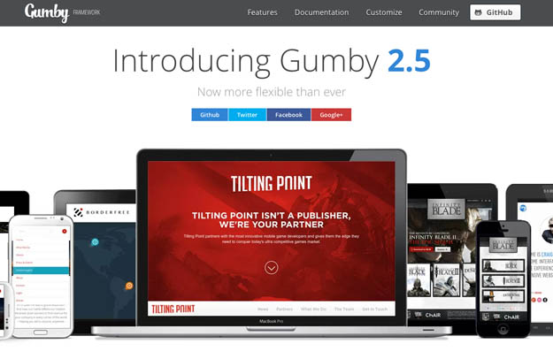
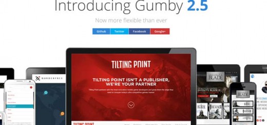
Gumby Framework is a flexible, responsive CSS Framework, Powered by SASS. Create rapid and logical page layout and app prototypes with a flexible and responsive grid system and UI kit. It is built with the power of Sass. Sass is a powerful CSS preprocessor which allows us to develop Gumby itself with much more speed — and gives you new tools to quickly customize and build on top of the Gumby Framework.
2. Solved by Flexbox
Flexbox is not another CSS framework. Instead, its purpose is to showcase problems once hard or impossible to solve with CSS alone, now made trivially easy with Flexbox. View the styles in the Web inspector or dive into the source to see just how easy CSS layout will become.
3. UI Kit
UIkit is a lightweight and modular front-end framework for developing fast and powerful web interfaces. UIkit gives you a comprehensive collection of HTML, CSS, and JS components which is simple to use, easy to customize and extendable. UIkit is developed in LESS to write well-structured, extendable code which is easy to maintain.
4. SkelJS
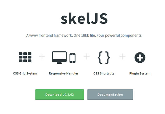
skelJS is a lightweight frontend framework for building responsive sites and apps. Consisting of only a single JS file (weighing in at just 18kb as of this version), it gives designers and developers access to four powerful components: CSS Grid System, Responsive Handler, CSS Shortcuts and Plugin System.
A sophisticated 12 column CSS grid system with a concise, uncluttered syntax, adjustable gutters, unlimited nesting support and many more cool features. A streamlined replacement for CSS media queries designed to handle all of your responsive needs. Simple to configure, built to handle any number of breakpoints, and capable of doing much more than simply shuffle stylesheets.
5. Cardinal
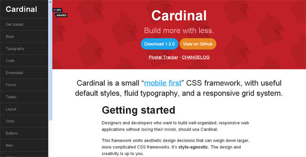
Cardinal is a small, “mobile first” CSS framework with some useful default styles, scalable typography, reusable modules, and a simple responsive grid system. Cardinal provides a new approach to scaling web typography and layout across multiple devices. It places little emphasis on pixel-precision, but does not restrict its usage. Instead, Cardinal leverages modular scale, unit-less line heights, and the power of the REM unit to make it simpler to resize the typography and layout of your entire application for different devices.
6. Layers CSS
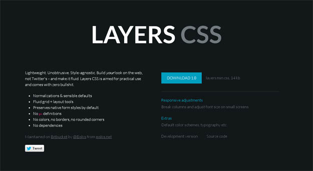
Layers CSS is a lightweight CSS framework that doesn’t emphasize any designs but handles the main structure. It has support for responsive layouts with fluid grids and simple classes are used for dealing with them. There are styles for forms, tables, lists and more but no colors or rounded-corners, customization is totally up to you. Layers also comes with handy “everyday-use-styles” for clear, floats or hiding.
7. Grid Forms
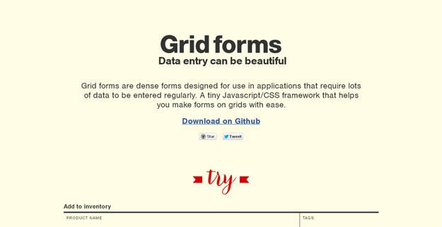
An effort to make beautiful forms for web applications that make data entry less painful. Grid forms is a front-end library which handles the boiler plate necessary to build grid based forms.
Grid forms are dense forms designed for use in applications that require lots of data to be entered regularly. It’s a tiny Javascript/CSS framework that helps you make forms on grids with ease. You can also include Scott Jehl’s Respond.js if you want the form to be responsive in ie8.
8. Gridism
Gridism is a simple responsive grid that’s easy to use. On screens smaller than 568px wide, grid units are stacked, while on larger screens grids can have a maximum width of either 978px or 1140px.
9. Maxmert
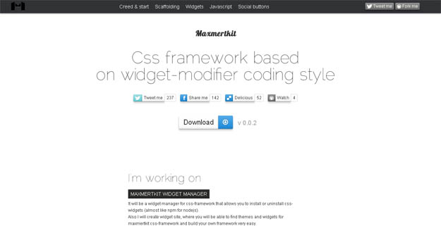
Maxmertkit is a fresh one that looks/feels a bit like Bootstrap but has different things to offer. It uses SASS for the CSS part and includes styles for all major stuff like grid, typography, forms, tables, buttons and lists. There are various widgets like buttons, tabs, grouped elements, badges, dropdowns, tooltips, menus and more. And, some handy JavaScript components exist for notifications, carousel, buttons, modals, etc. Like mentioned, it feels like Bootstrap on some parts but differentiates in details where one of them is the choice of the icon fonts which are Font Awesome and Zocial.
10. Cascade Framework
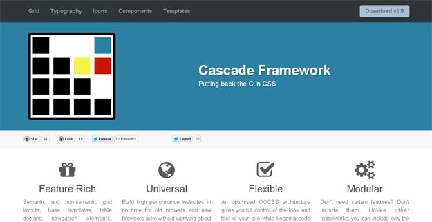
Although the overall look and feel of Cascade Framework mostly inspired by Twitter Bootstrap, Cascade framework is not just another Bootstrap clone. Where Twitter Bootstrap puts its focus on delivering shiny user elements that can be dropped into any project and takes control of your project’s overall look-and-feel, Cascade Framework is intended to do the opposite. By splitting your CSS into separate files based on features rather than selectors as well as by implementing a modifier design pattern inspired by SMACCS and OOCSS, Cascade Framework puts you in control!
11. Rocket CSS
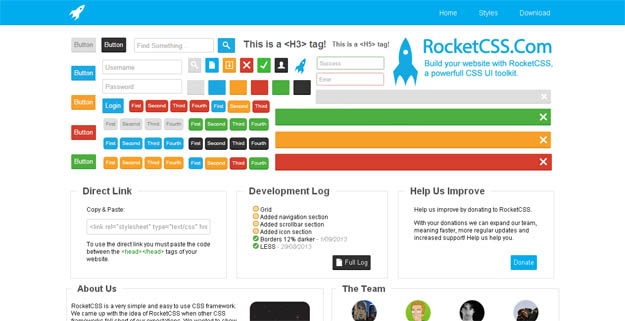
RocketCSS is a very simple and easy to use CSS framework. This framework includes almost everything from websites buttons to website icons and, lets you make your website visually exciting and compel visitors to stay and interact.
12. Kube Framework
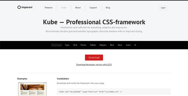
The Kube Framework is not an overblown responsive CSS framework with multiple layouts and styles, all you have with Kube is a single CSS file. That is were its beauty lies – in its simplicity. The framework also supplies LESS files for the gurus out there who enjoy preprocessing.
