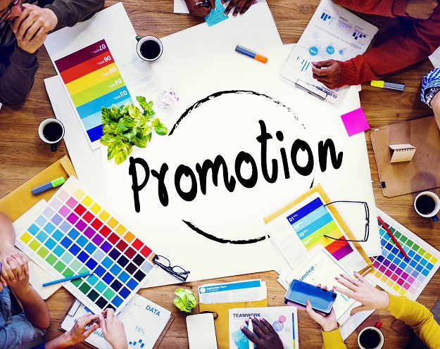
If you got a new product, service, or upcoming event, you have a need for attractive promotional design.
After all, this is your opportunity to grab a stranger’s attention and convert them into a loyal customer.
How do you accomplish that?
We’ll show you in this brief but informative look at effective ad design.
Follow most or as many of the insider tips below as you can to maximize your chances of increasing both your following and revenue!

1. Make the Product the Centerpiece
This might seem like a no-brainer, but don’t underestimate human creativity. Instead of placing announcements anywhere else, try to keep them at the center of your ad to draw the eye in.
If trying to launch unmanned vehicles, showcase them and demonstrate how it works. If you’re introducing a new dish, you can organize a mini cooking show or have attendees get a free taste.
If the ad is cut up into two equals pieces, give each half a focus, and make the focus your announcement. Whatever your design choice, don’t leave the “focus” in the background.
2. Consider Simple Design Tools
Sometimes, platforms like Adobe InDesign are too complicated for the average user. Instead, you should look for more automated and simple services.
Design your own invite with Adobe’s invitation maker instead, or try your hand at another online program like Canva.
3. Try a Minimalist Design
The minimalist design (if pulled off correctly) always gives a unique and classy perspective to a product. Landmark companies like Apple use minimalist design to show off the sleekness of their products and to let them outshine design.
Minimalist design is a timeless choice that will help to harness the power behind negative space.
4. Experiment with Color
Colors have to match not only the company theme or image, but also the specific event or product in question. You should begin by asking what themes or color palates lend the most creative help when promoting through an ad.
The color specialists at Pantone have developed an online color picker that helps boils down some alternate shades and complementary colors.
5. Determine Appropriate Fonts
Fonts have as much design and creativity in them as anything else you could put into an advertisement. Consider Google Fonts and look to competitors or other ads that you find especially effective for inspiration.
Don’t get lost in elaborate design if your idea is to stay simplistic. However, an ornate font may add a finishing touch to a clean design if handled appropriately. Experiment with options and try not to go over three fonts in one design.
6. Consider Images
Images provide a lot of use in design, from being overlaying focal points to busy background images. They allow you to express something more about your business, but they can also get chaotic and distracting.
Keep focal points simple if using images. A person or two, for example, can add a much-needed human element to your design.
7. Don’t Overcrowd
Don’t get carried away with all your design talent! While not everything has to be simple or minimalist, you don’t want to muddy your message with too much design.
Consider banners and borders, but be careful to balance out the design so your announcement is bold and in focus without distraction.
Additional Design Resources at Code Geekz
If you’re looking for more promotional design insight from the professionals, then head on over to our website! We have tons of blog articles and web pages to help beginner and experienced designers alike take their skills to the next level!
Check out our resources now to get started!


