In modern web design era responsive design has become favorite for number of designers and developers . Everyone wants their websites to run on smart devices to grab more exposure. From menu to grid columns even with the images and videos responsiveness is always a feature to consider.
In this article we have collected some handpicked 25 Responsive jQuery Navigation Plugins that will help you to create beautiful menus, tabs, columns and navigation system for your websites. Following jQuery Navigation Plugins are easy to use and make your website eye catching and visually stunning.
1. MenuItems
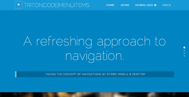
MenuItems is a dynamic jQuery menu plugin that lets you create beautiful and responsive navigation widgets.
2. Sidr
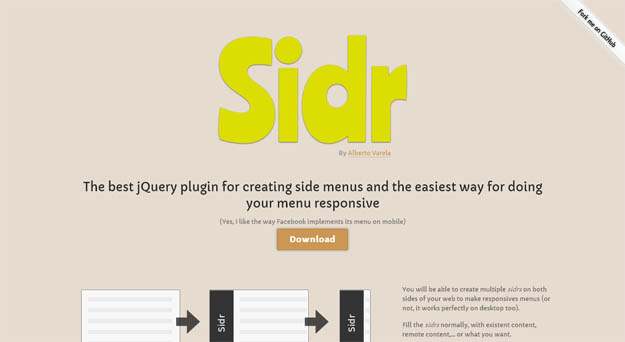
Sidr is a jQuery plugin for creating “hidden side menus” on-the-fly. It can be set to be displayed at right or left, a single page can have multiple side menus and offers multiple methods (existing or remote content) for loading the content.
3. Material Menu
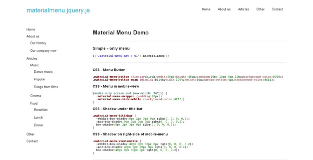
Material Menu is a jQuery plugin that creates an responsive menu on website.
4. Responsive Tabbed Navigation
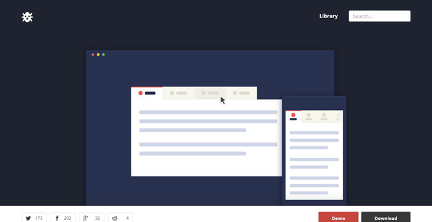
A handy tabbed navigation, optimized for mobile devices, with support for both horizontal and vertical menu positioning. It’s created by using CSS and jQuery.
5. PGW Menu
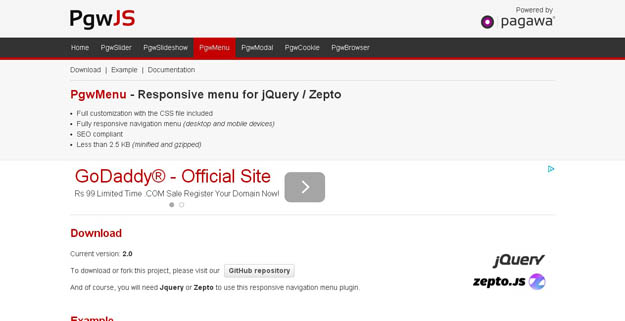
PGWMenu is a responsive menu for jquery comes with seo compliant, and fuclly customizable with css file included.
6. jQuery Slimmenu
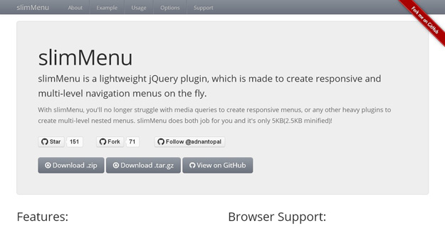
slimMenu is a lightweight jQuery plugin, which is made to create responsive and multi-level navigation menus on the fly. With slimMenu, you’ll no longer struggle with media queries to create responsive menus, or any other heavy plugins to create multi-level nested menus. slimMenu does both job for you and it’s only 5KB(2.5KB minified)!
7. jQuery Sliding Menu
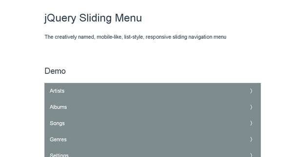
jQuery Sliding Menu is a mobile-like, list-style, responsive sliding navigation menu.
8. Responsive Tabs
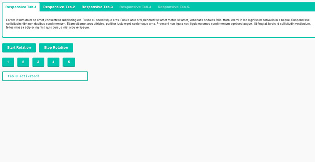
Responsive Tabs is a jQuery plugin that provides responsive tab functionality. The tabs transform to an accordion when it reaches a CSS breakpoint. You can use this plugin as a solution for displaying tabs elegantly on desktop, tablet and mobile.
9. Mmenu

The best jQuery plugin for app look-alike on- and off-canvas menus with sliding submenus for your website and webapp. It is very customizable through a wide range of options, extensions and add-ons and it will always fit your needs.
10. Flex Nav
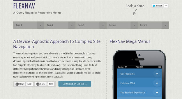
FlexNav is a mobile-first example of using media queries and javascript to make a decent multi-level menu with support for touch, hover reveal, and keyboard tab input accessibility. Special attention is paid to touch screens using tap targets (the key feature of FlexNav).
11. Responsive Full Width Tabs
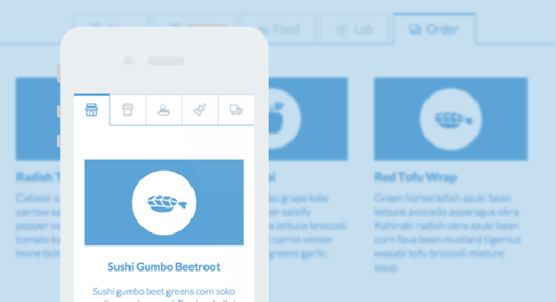
A full width tab component with some example media queries for adjusting the icons of the tabs and the content layout. The main idea is to show only icons for the mobile view and allow the text to appear when there’s enough space. The content columns and the containing media boxes have three different layouts.
12. Fixed Nav
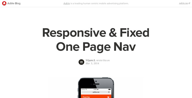
Fixed Nav is a responsive, fixed and touch friendly one page navigation with animated scrolling.
13. Daisy Nav
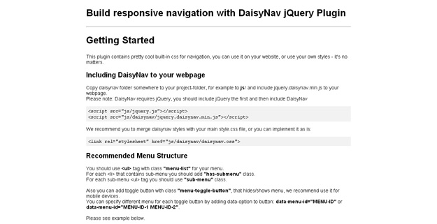
DaisyNav jQuery Plugin help you to build responsive navigation for your website. It is wordpress ready, IE compatible and built in CSS for dropdown navigation.
14. Navgoco

Navgoco is a simple JQuery plugin which turns a nested unordered list of links into a beautiful vertical multi-level slide navigation, with ability to preserve expanded submenus between sessions by using cookies and optionally act as an accordion menu.
15. Naver
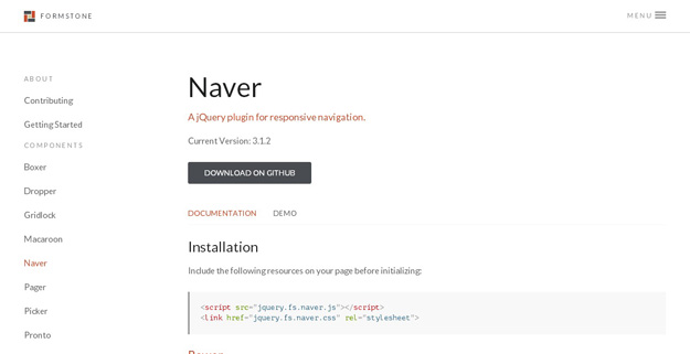
Naver is a jQuery plugin for responsive navigation. It is an easy way to turn any navigation system into a responsive-ready, mobile-friendly toggle. The navigation states can be also be animated. It has been tested in Firefox, Chrome, Safari, IE7+.
16. Smart Menus
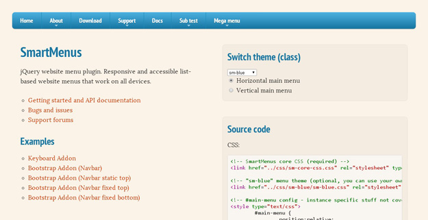
The SmartMenus is a feature-rich plugin that will create a horizontal or vertical responsive and accessible list-based menu that works on all devices.
17. jQuery Fluid Content Scroller
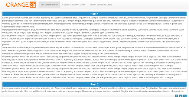
jQuery Fluid Content Scroller plugin makes navigation through long item lists like news, events, blog posts, etc. smooth and easy. Plugin is represented with the tabbed navigation panel at the top and at the bottom of the page / list container allowing to instantly scroll up and down to a particular post on the list.
18. Menu-aim

menu-aim is a jQuery plugin for dropdown menus that can differentiate between a user trying hover over a dropdown item vs trying to navigate into a submenu’s contents.
19. HorizontalNav
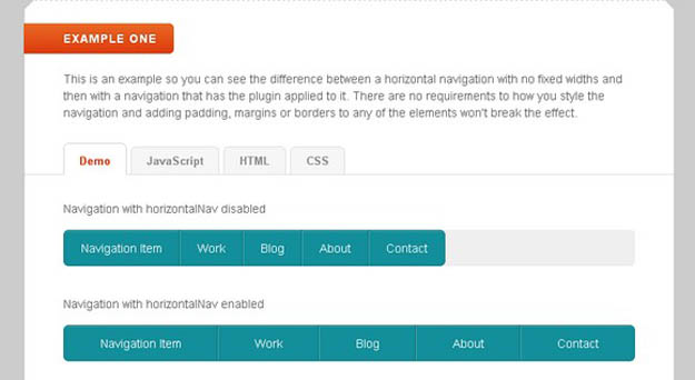
HorizontalNav is a jQuery plugin that spans a horizontal navigation to fit the full width of it’s container. If you’ve ever had to create this effect on a project, you’ll know it’s pretty annoying to do. But this plugin makes it easy, even on responsive designs.
20. SlickNav
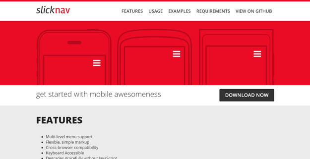
SlickNav is a responsive mobile menu plugin for jQuery, comes with number of feautres such as cross browser compatibility, keyboard accessible, supports with multi level menus and many more.
21. TinyNav.js

TinyNav.js is a lightweight plugin (362 bytes) that converts ul and ol menus into a select dropdown. It also automatically selects the current page and adds selected=”selected” for that item.
22. Menutron
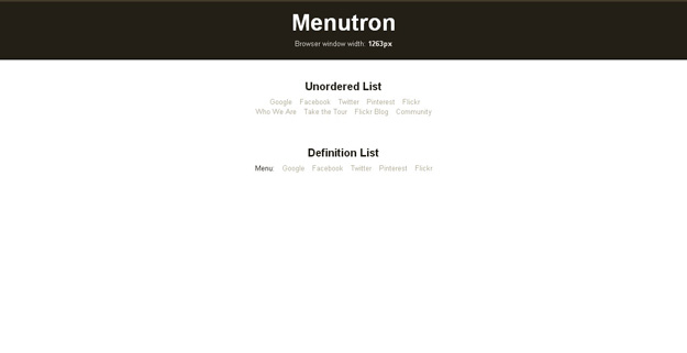
Menutron transforms your navigation menus from a list to a select menu when resizing your browser. On mobile devices, the select menu pulls up a native control, making it easier to pick an item.
23. Flaunt.js

Flaunt.js is a jQuery script that allows you to create a responsive, nested navigation out the box. Flaunt was built to overcome responsive design challenges which faced a huge percentage of websites.
24. jPanel Menu
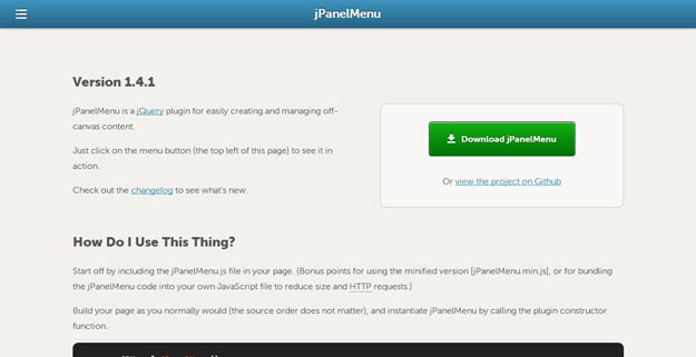
jPanelMenu is a jQuery plugin that creates an animated paneled-style menu (like the type seen in the mobile versions of Facebook and Google). Animation is handled by CSS transitions for browsers that support it and are hardware-accelerated on supporting devices, so the animations are silky smooth.
25. Repsonsive Toggle Menu
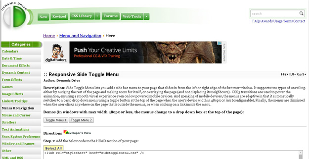
Side Toggle Menu lets you add a side bar menu to your page that slides in from the left or right edge of the browser window. It supports two types of unveiling- either by nudging the rest of the page and making room for itself, or overlaying the page.


