When it comes to Responsive Frameworks, there are innumerable and varied which one can find on the web. Several of these, such as the popular Bootstrap, Gumby and Foundation frameworks, possess nearly everything when it comes to building a front-end system of any type and size, however- there are also other frameworks, such as Skrollr, which specializes towards one particular function ( i.e., parallax scrolling).
As mentioned – the choices are endless and varied, and it may at times become impossible and overwhelming to decide upon which Framework to choose for a given project.
Within the past year, the one vital aspect which tends to be more evident when it comes to Frameworks of any kind – is that Developers have shifted their intent from overloading an exorbitant amount of functions into them and instead making them more “lightweight” by simply incorporating the bare necessities required; inasmuch – ensuring a seamless integration as well as speed regarding hand-held devices.
Nothing excessive – but simply the bare basics, simplicity accompanied by a solid structure by which to build responsive sites upon- since we are all in need of “speed” !
Thus, in keeping the keywords lightweight front-end framework in mind, we would like to present you with 25 Best Responsive Frameworks for your consideration and your next upcoming web project which you may not have been aware of.
1. Skeljs
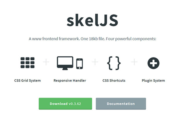
skelJS is a lightweight frontend framework for building responsive sites and apps. Consisting of only a single JS file (weighing in at just 18kb as of this version), it gives designers and developers access to four powerful components: CSS Grid System, Responsive Handler, CSS Shortcuts and Plugin System.
2. UI Kit
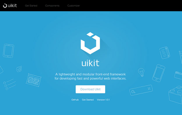
UIkit is a lightweight and modular front-end framework for developing fast and powerful web interfaces. UIkit gives you a comprehensive collection of HTML, CSS, and JS components which is simple to use, easy to customize and extendable. UIkit is developed in LESS to write well-structured, fully responsive, extendable code which is easy to maintain.
3. GetWebplate
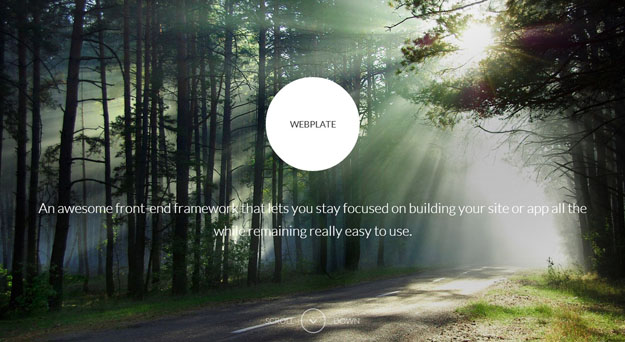
An awesome front-end framework that lets you stay focused on building your site or app all the while remaining really easy to use. Everything from a robust responsive layout engine, to global button elements, customizable forms and support for IcoMoon icon fonts. Webplate includes jQuery, Modernizr and Typeplate by default and has a ton of extra tools and features to access.
4. Cardinal
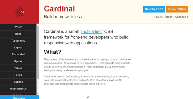
Cardinal is a small, “mobile first” CSS framework with some useful default styles, scalable typography, reusable modules, and a simple responsive grid system. Cardinal provides a new approach to scaling web typography and layout across multiple devices. It places little emphasis on pixel-precision, but does not restrict its usage. Instead, Cardinal leverages modular scale, unit-less line heights, and the power of the REM unit to make it simpler to resize the typography and layout of your entire application for different devices.
5. Schema
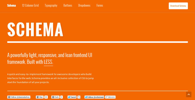
Schema is a powerful light responsive and lean frontend UI framework built with Less. Schema provides an all-inclusive collection of CSS to jump start the foundation of all your projects.
6. Kickoff
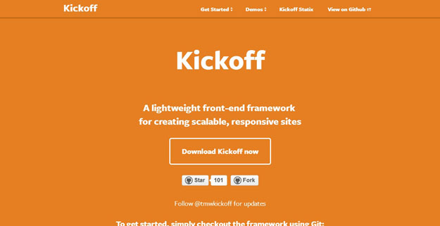
A lightweight front-end framework for creating scalable, responsive sites, it has many features such as built in a mobile-first, responsive philosophy (but can easily be used for fixed sites as well), Sass compilation uses autoprefixer to dynamically add vendor prefixes so you don’t even have to think about it, and Starter form element styles: stacked on small-screen to 2-column (if you choose) at the breakpoint of your choice.
7. Pure
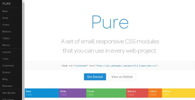
Pure is a set of small, responsive CSS modules that you can use in every web project. Pure is ridiculously tiny. The entire set of modules clocks in at 5.7KB minified and gzipped, without forgoing responsive styles, design, or ease of use. Crafted with mobile devices in mind, it was important to us to keep our file sizes small, and every line of CSS was carefully considered. If you decide to only use a subset of these modules, you’ll save even more bytes.
8. Base
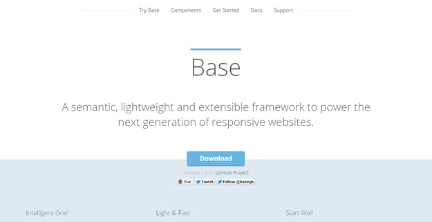
Base is a semantic, lightweight and extensible framework that allows you to create fluid and fixed grids with your own widths, columns, gutters, offsets and padding. Built on beautiful, configurable LESS CSS engineered around a set of variables and mixins. Base is ready to transform into any site you throw at it.
9. Spark
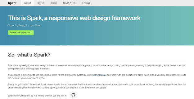
Spark is a lightweight, new web design framework based on the mobile-first approach to responsive design. Using media queries powering a responsive grid, Spark makes it easy to build professional looking pages in minutes. It’s designed to be simple to use with intuitive class names and easy to customize with a nonintrusive approach: with the exception of some basic styling, you only add Spark classes to the elements you actually need style.
10. Hoisin.Scss
Hoisin is a very simple responsive front end mini framework made to kick start your web project, written in Sass. This framework was created as an alternative to more complex and bloated front end frameworks, with a focus on organisation, speed and flexibility.
11. Kindling Grid
A responsive grid system, with some trace elements of style and markup.
12. GetSkelton
Skeleton is a small collection of CSS files that can help you rapidly develop sites that look beautiful at any size, be it a 17″ laptop screen or an iPhone. Skeleton is built on three core principles: Skeleton has a familiar, lightweight 960 grid as its base, but elegantly scales down to downsized browser windows, tablets, mobile phones (in landscape and portrait). Go ahead, resize this page!
13. BassCSS
BASSCSS is a lightweight collection of base styles and simple type and layout utilities designed for speed, performance, and scalability. Use it out of the box for simple sites and prototypes or as the base for a larger SASS project.
14. Typebase
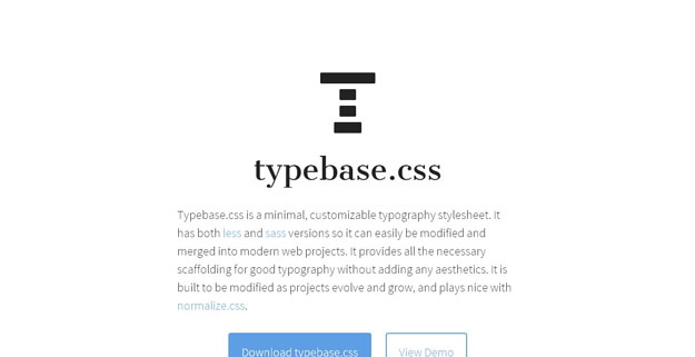
Typebase.css is a minimal, customizable typography stylesheet. It has both less and sass versions so it can easily be modified and merged into modern web projects. It provides all the necessary scaffolding for good typography without adding any aesthetics. It is built to be modified as projects evolve and grow, and plays nice with normalize.css.
15. Emerald
Emerald is a responsive grid system written in LESS, By default Emerald uses for both column and gutter widths 6vw on mobile and 20px on tablets and above. In result, a line can accomodate 16 .e-1 columns on tablet (or one big .e-16 – you know how it works, right?), 8 on mobile, and 25 on desktop.
16. Ink
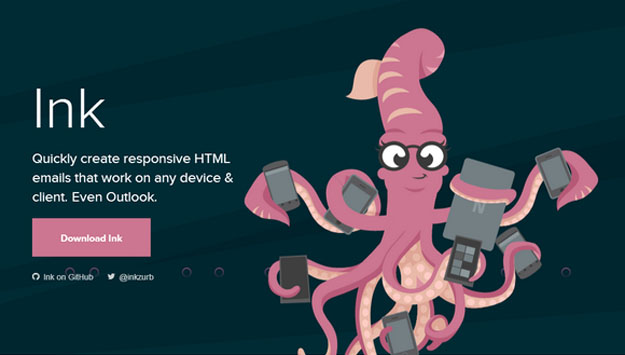
Ink helps you quickly create responsive HTML emails that work on any device & client. You can reach out your tentacles to a broad range of people who subscribe to your emails. The CSS framework helps you craft HTML emails that can be read anywhere on any device.
17. Layer CSS
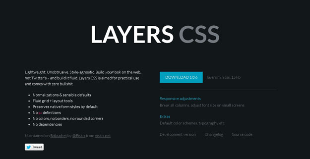
Layers CSS is a lightweight CSS framework that doesn’t emphasize any designs but handles the main structure. It has support for responsive layouts with fluid grids and simple classes are used for dealing with them. There are styles for forms, tables, lists and more but no colors or rounded-corners, customization is totally up to you. Layers also comes with handy “everyday-use-styles” for clear, floats or hiding.
18. Flexbox Grid
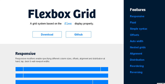
The Flexbox Grid is a system based on the flex display property.
19. Sculpt
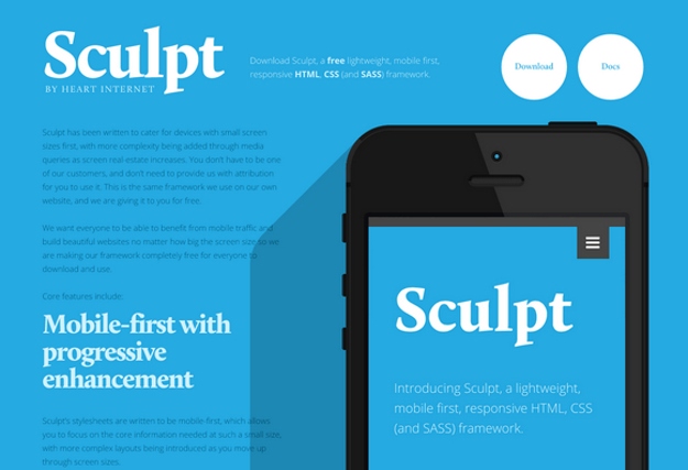
Sculpt is a lightweight, mobile first, responsive HTML, CSS and SASS framework. It has been written to cater for devices with small screen sizes first, with more complexity being added through media queries as screen real-estate increases. With three grid sizes (732px, 960px and 1140px) built in and active depending on your device’s screen size you can be sure your content will be well presented no matter the conditions.
20. Furatto
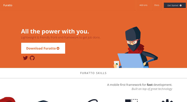
Furatto is a front-end framework, that uses Bootstrap and Foundation as a base, for developing websites quickly. The framework makes use of the popular flat UI trend and built with responsive layouts in mind. Besides the typography + grid, it has styles for all the major elements like buttons, tables or forms and various JavaScript components like modal or tooltips.
21. Fitgrd
.Fitgrd is not a framework. It’s a solid foundation to build up your own responsive website. It is designed for rapid prototyping, but also runs well in production environments. This grid system is perfect for advanced web designers who don’t want to have their pages look like “bootstraped”. Everything but the grid is up to you and gives you the ability to save a lot of dispensable code. Give it a try and you’ll love it.
22. Ivory
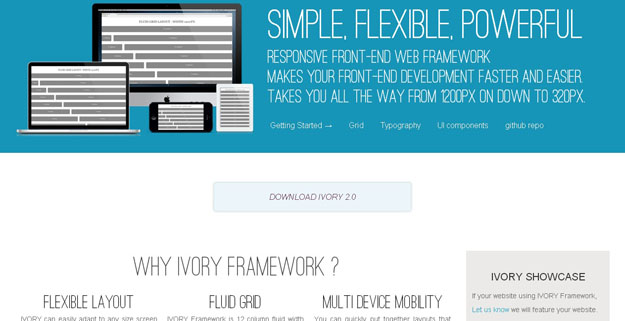
IVORY is a lightweight front-end framework that can handle responsive layouts from 320px to 1200px widths. It has a 12-column grid and comes with styles for typography, forms, buttons, tables, pagination, toggle-switches, tooltips, accordion, tabs and more.
23. Cute Grids
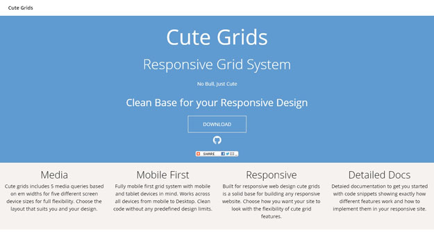
Cute Grids is a responsive grid system full of features to help designers and developers get started with their responsive layout. Cute grids includes 5 media queries based on em widths for five different screen device sizes for full flexibility. Choose the layout that suits you and your design. Fully mobile first grid system with mobile and tablet devices in mind. Works across all devices from mobile to Desktop. Clean code without any predefined design limits.
24. Fluidity
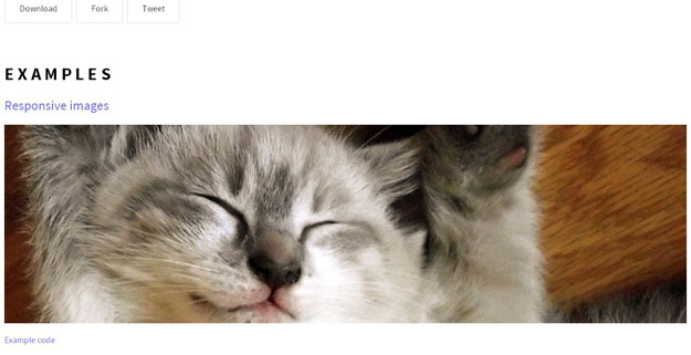
Fluidity is a tiny bit of CSS (107 bytes total) that fixes the part of HTML that isn’t completely responsive. It makes changes to the way images, tables, iframes, preformatted text, and canvas elements, so that they’re completely responsive.
25. Gridism
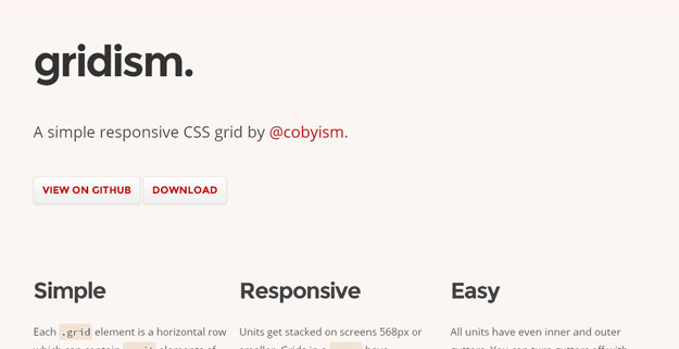
Gridism is a simple CSS grid that comes with in-built patterns for responsive design.
