Responsiveness consists of a mix of flexible grids and layouts, images and an intelligent use of CSS media queries. When the end-user switches from their laptop over to their iPad, the website being viewed should automatically switch to accommodate that particular resolution, image size and scripting abilities.
Creating a Responsive site is becoming easier and attainable for nearly every website owner and anyone who is not a certified “code expert”. With the use of tools, jquery plugins, users now have at their disposal a sufficient number of responsive design plugins by which to implement and utilize in order to achieve desired Responsiveness within their websites.
There are myriad of tools to help you to generate responsive layouts, I’ve sorted through some of the tools available and put together this list to help through the phases of the responsive design and development process. If you are aware of any other tool, please share with us by posting a comment below. Enjoy !!
Mockups, Wireframing Tools
These wireframe and mockup applications let you visually strip the product and concentrate on user interactivity and its functions. These wireframe tools and mockup applications offer splendid features that help to save your precious time and create epitomes of designs for all our clients and teams.
1. Wirefy
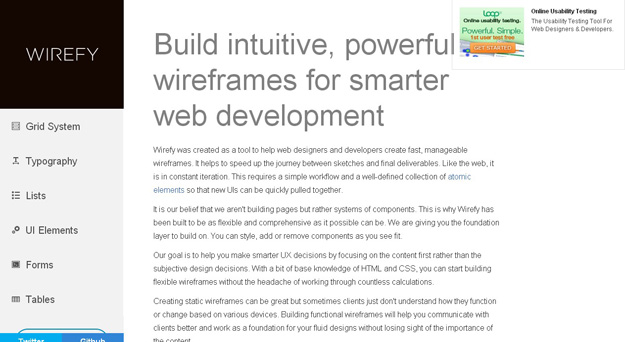
Wirefy is an amazing wireframing and mockup application that extends massive help to all the web developers and designers. It paces up the journey right from sketches to final deliveries. It demands a simple workflow so that new UIs are easily pulled together.
2. Hotgloo
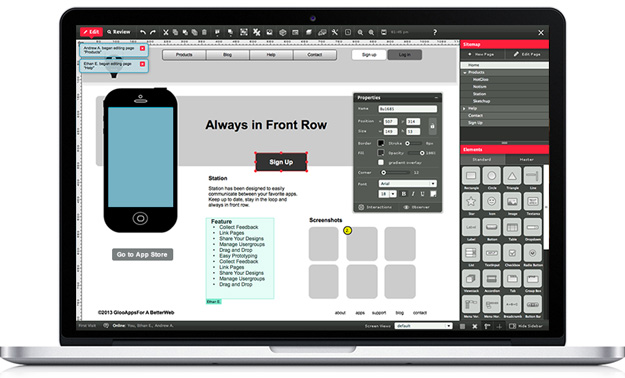
HotGloo is another desirable mockup and wireframing tool that allows you to co-work with your team members and send the preview links to all your clients. It enables you to get garner feedback and build changes and alterations nimbly without even touching a line of codes. It offers more than 50 UI components and prebuilt UI master library.
3. Responsive Wireframes
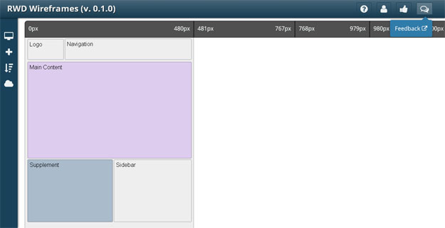
Responsive Wireframes is a free and web-based tool for quickly creating wirefames for any project. It enables us to insert elements, style them (color, opacity), add text and also resize if wanted. These elements can be re-positioned with drag ‘n drops and the work can be saved for future reuse. The tool is focused on responsive layouts as we can define multiple viewports and decide how each element will look on different viewports.
4. MockUPhone
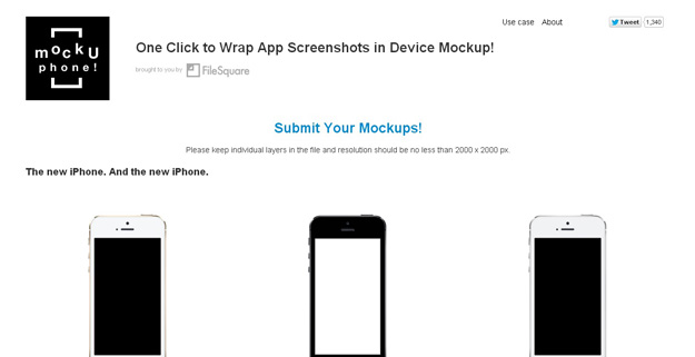
MockUPhone, a free to use web app, simplifies creating such mockups a lot. It asks you to choose a device from a list of popular tablets + phones and upload the screenshots with drag ‘n’ drops. Once uploaded, the screenshots in different orientations + views are generated automatically and offered for download.
5. Style Tiles
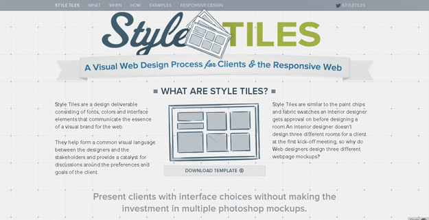
Style Tiles are a design deliverable consisting of fonts, colors and interface elements that communicate the essence of a visual brand for the web.
They help form a common visual language between the designers and the stakeholders and provide a catalyst for discussions around the preferences and goals of the client.
Generating Responsive HTML and CSS
Once the mock-ups and the wireframes are done, we will look forward to code. Writing out the CSS with multiple breakpoints and media queries isn’t exactly the most enjoyable part of coding.
Here are few tools that help you generate responsive codes for your web applications.
6. Pure CSS
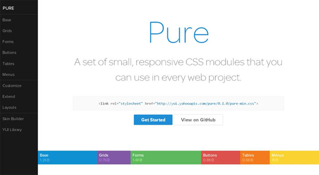
Pure is a set of small, responsive CSS modules that you can use in every web project. Pure is ridiculously tiny. The entire set of modules clocks in at 5.7KB minified and gzipped, without forgoing responsive styles, design, or ease of use. Crafted with mobile devices in mind, it was important to us to keep our file sizes small, and every line of CSS was carefully considered. If you decide to only use a subset of these modules, you’ll save even more bytes.
7. Responsive Web CSS
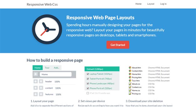
It is a web-based tool that enables anyone to create a responsive layout skeleton with drag ‘n’ drops. You can simply add any number of pages, divs and define the widths in percentages. There is support for nested grids and it is possible to select the targeted devices.
8. Responsive Tables
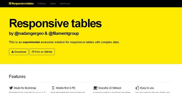
RWD Table Patterns is an experimental awesome solution for responsive tables with complex data. It’s a fork based on Filament Group’s repo with a more complete solutions and some new features.
It’s built with mobile first and progressive enhancement in mind. In browsers without JavaScript, the tables will still be scrollable. And there’s still some responsiveness. You only need to add one JS-file, one CSS-file and some minimal setup to make the tables responsive.
9. Type Rendering Mix
Type Rendering Mix is a tiny JavaScript library that allows to apply styles only when Core Text is used (iOS and OS X) in order to achieve a more consistent rendering while preserving the accuracy of sub-pixel antialiasing.
10. Ink
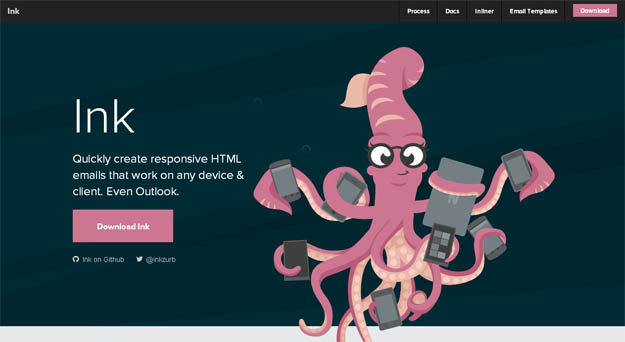
Ink helps you quickly create responsive HTML emails that work on any device & client. You can reach out your tentacles to a broad range of people who subscribe to your emails. The CSS framework helps you craft HTML emails that can be read anywhere on any device.
11. Macaw
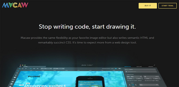
Macaw truly empowers designers to create websites without any help. Positioned as a web design tool rather than a web development tool, the tagline says it all “Stop writing code, start drawing it.” Macaw is a native application that you need to download and install, rather than an in-browser tool.
Fonts, Images and Videos
Once we have the basic code in place, we’ll need to get to the finer details – the fonts, images, videos, etc. jQuery plugins can help do most of the heavy lifting here. Let’s take a look.
12. Pageres
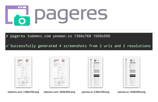
Pageres is a command-line tool for generating screenshots in different resolutions for websites. Pageres is focus on sizes: you could script it to generate screenshots of responsive websites. The command-line options allow you to specify many dimensions at once, so it’s easy to generate results for a responsive site.
13. Adaptive Images
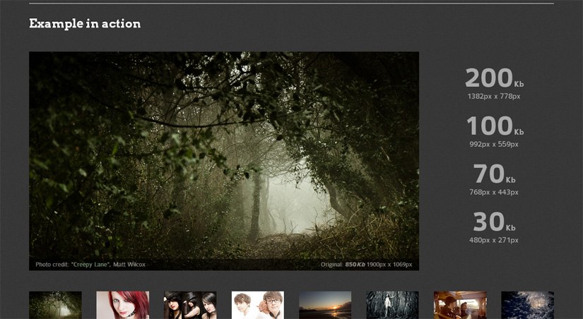
Adaptive Images detects your visitor’s screen size and automatically creates, caches, and delivers device appropriate re-scaled versions of your web page’s embeded HTML images. No mark-up changes needed. It is intended for use with Responsive Designsand to be combined with Fluid Image techniques.
14. FitVids.js
After images, it’s time to make videos responsive. Unless you really know your way around responsive coding, you may want to just skip over to FitVids.js. It’s a lightweight jQuery plugin that adjusts the size of embedded videos to match the screen size, while maintaining the right aspect ratio.
15. Responsive Elements
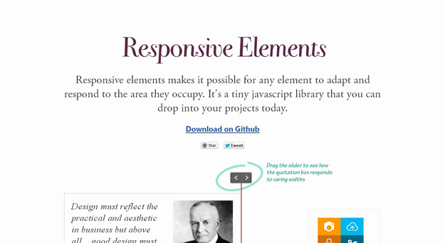
Responsive Elements makes it possible for any element to adapt and respond to the area they occupy. It’s a tiny javascript library that you can drop into your projects today. The element is aware of it’s own width. It responds and adapts to increasing or decreasing amounts of space. You can easily explicitly declare which elements you want to be responsive using a data-respond attribute.
16. Froont
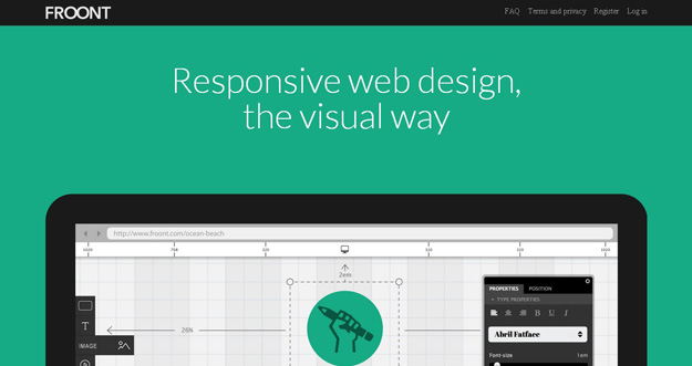
FROONT is a web-based design tool that runs in the browser and makes responsive web design accessible to all kinds of visual designers, even those without any coding skills.
FROONT makes responsive web design visual. Design can be done in-browser with intuitive drag-and-drop tools. After all, humans judge design with their eyes therefore it seems just normal to see right away how designs will look across all different screen sizes.
Responsive Design Testing Tools
The tools listed above were to help you design and develop your responsive website. But of course, you can’t launch your site without testing it. So here are few useful tools that will help you test your applications on different devices.
17. Viewport Resizer
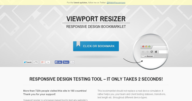
Viewport resizer is a browser-based tool to test any website’s responsiveness. Just save the bookmarklet, go to the page you want to test, click on your created bookmarklet and check all kinds of screen resolutions of the page.
18. Responsive.IS
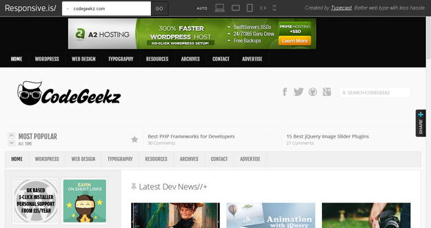
Responsive.Is is developed by TypeCast another impressive responsive design testing tool, which you can use to test your responsive design. Just type in a URL, and it will automatically change its size depending on the device you choose.
19. Protofluid
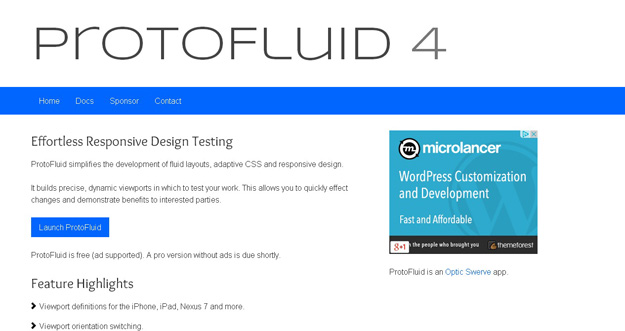
ProtoFluid simplifies the development of fluid layouts, adaptive CSS and responsive design. It builds precise, dynamic viewports in which to test your work. This allows you to quickly effect changes and demonstrate benefits to interested parties. It is free and lets you use other extensions like FireBug.
20. Responsive Web Design Testing Tool
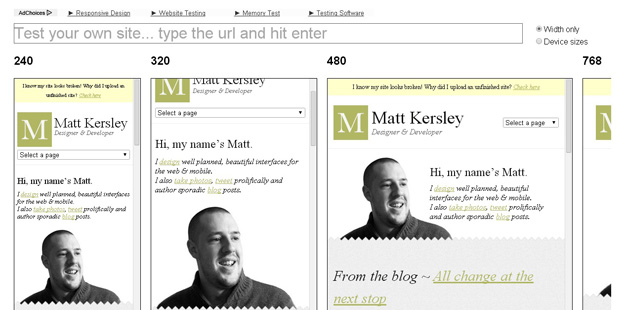
Responsive Web Design Testing tool has been built to help with testing your responsive websites while you design and build them.


